Monday, January 2, 2017

Fun_ThisMustBeIt


Even though last time was the last post of 2016, it didn't really register that today is, then, the first post of 2017, so we should actually do an extra spooshal post that I can refer back to later, so here's our first new drawing of 2017, Vicky hanging out with a giant year-of-the-rooster rooster. I was surprised to find this piece represents a good number of my New Years' resolutions. The question is: is this the year of the cowardly chicken...or the proud...cough.


Last year's resolution was big and tediously labor intensive, but totally doable via daily chip-awayism, so I want to use that same guiding framework this year. The goal was simply to get my site up to date after being sparsely updated over the past two or three years. I was able to accomplish that by spring from working on about three posts every day (I'd still been drawing, so it was 80% a matter of posting from my backlog). So with that same, daily chip-away approach towards something big, I want to enumerate my goals, so it's on the record for me to live or fail by. Onward to this year's resolutions, in no particular order.


Goal 1: Draw more digital pieces.
Quantifiable: 1 digital drawing a week.
Today's lead piece is a great example of that. Originally, I had just wanted to draw this traditionally in my sketchbook, but then I kept thinking...this could so easily be digital, and you'd get closer to what you're imagining, why aren't you just doing this digitally? Perhaps the solution is to pencil traditionally and then carry over to digital, since I find going straight digital is often kinda difficult. Perhaps the solutions is to brute-force it 100% digital until it works. One of my mentors says to go digital 100%...I know...I know...


Goal 2: Draw at least 3 comics and some SLSs
Quantifiable: Coverage Draft, Splinter, and Songs About Chie, + 12 Sick Little Suicides.
Normally, I've found that speaking of anything I'm working on tends to be a death-knell for the project, but I'm treating these as chunks of "chip-away" actions. I have scripts and thumbnails for all of these stories, so it's simply a matter of making the pages. This is all chip-awayable...tedious but doable. As for SLS, since it's current events-based, I already know at least one topic I would like to cover, and I imagine it'll be more necessary and responsible to be more engaged going forward anyway, so doing one a month should be plenty reasonable. Splinter's up first, but Coverage Draft's the ultimate goal.


Goal 3: Draw more fan art.
Quantifiable: 1 fan art a month.
I've had super mixed emotions about fan art. It feels like selling out. It feels phony. It feels like begging for attention because you suck too much to earn it yourself with your own stuff. At the same time, I recognize it's part of the "metagame" of making entertainment. I mean, Garry Trudeau mentioned the very same principle that I used to guide my success with ZLM--to paraphrase an interview, he said something like, "People care about themselves, so I drew comics about my classmates, and they loved it."

Can I let you in on a secret? 97% of the time, I don't care about anything so much I want to do fan art for it, even if I love the subject; it's simply a device to rope people into looking at my stupidity. It's me saying, "I bet you this many hours of my life I'll make you care I drew something, because you couldn't care less that I exist otherwise." Cherishing and being inspired by work is usually enough. I express my love by incorporating it into my own work. Just flat out, "Here's Recognizable Reference, fellow young people!" feels so hollow.


When do I feel fan art is tolerable? When it feels necessary. When the love for the subject is simply overflowing to warrant the hours and hours it takes to make a piece strictly about it--not referencing or subtly indicating it, but directly depicting it. When it is so arresting it quells any feelings of "this isn't actually of me." If anything, I feel much better doing fan art to niche stuff nobody cares about or that is out of the popular consciousness because that feels like a fair compromise...cashing in on stuff everybody knows off the top of their head...monkey dance and parlor tricks.

My attitude has to change this year. Or at least, I silently have to stomach doing more blatant, "dance like a monkey" fan art. I write this all out as a marker of how absurd this all is. I don't know if this also means actually throwing the work in people's faces...one of the ways I cope with doing fan art is leaving it for people to discover on their own, rather than sending it to the subjects. I dunno. I haven't figured that part out yet. Maybe I have to think of it like a job interview? I don't know if that makes it better or worse...


Goal 4: Study more.
Quantifiable: 30min+ every day.
Basically do more Algenpractice, like pose studies, lighting, color blob, etc. This is one I feel weird about...it doesn't quite feel as firm in my mind...I feel like I learn more from actually doing pieces rather doing arbitrary stuff for the purpose of study, but if he says it works...it...must. Anyway, 30min is shooting low on purpose. Ideally it'd be an hour at least, but I don't want to overwhelm myself as I did last summer...doing straight up studies makes me physically sad after a while, like eating chocolate-shaped vegetables. This may involve joining up with a group...I dunno. Again, this goal is the shakiest.

So that's pretty much it: Go digital, draw 3+ comics, do more fan art, study. These are all doable. They will take tedious, daily work, but we can freaking do it.

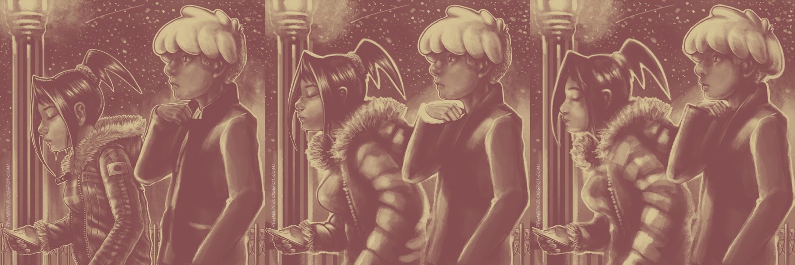
Oh, today's Z and Nyao art was our final art of 2016, actually inspired by that one J.C. Leyendecker piece (see, that's the kinda fan art that doesn't feel gross and predatory). I had thought it a good idea to do a traditional piece for our last of 2016, and a digital for first of 2017, as a representation of our overall goals. I didn't think to redo a traditional as digital until finishing the rooster piece traditionally. Anyway, these two pieces finished off my latest pocket sketchbook, so good times all around.

Not normal,

Reuxben

Friday, December 30, 2016

Fun_KidsLoveIt_Pt1


Wasn't sure what to post for the 2016 finale, so I decided to go with something that may be indicative of the future...fan art. I've always had mixed emotions about going overboard on fan art, but...2017 will be a year of putting myself outside of my comfort zone. So here is Wavebird from Loki IRL, by Pan-Pizza.


I ended up doing a series of 5 Pan-inspired pizzas. I mean pieces. It all started with wanting to draw one character in particular, who will be up Monday. I have a 100 yen pocket notebook I've been sketching in, and I should be clearing it by New Years' (tonight in Japan), so the Pan series was a nice little send-off for the bulk of the remaining pages, and after that I'll continue the march to focusing on digital...


Before going for the character I really wanted to draw, I decided to warm up with a simpler, more straightforward approach on Bianca, but soon enough I then wanted to try a more full-illustration approach as we moved on to Wavebird here, who is actually the fourth entry in the series.


I thought about working in some of my favorite video games, but settled on just doing a focal reference to Super Smash Bros. Melee, with only vaguely Majora's Mask and Windwaker-inspired blobs in the far background, in order not to detract with too busy of a background. The lower showcase has vaguely amiibo-like figures and a vaguely Pokemon poster, and the upper background is just riffing on a Gamestop photo since there don't seem to be any interiors of Game Splitters proper.


Here's what kicked off the "Kids Love It" series, Bianca, the heroine of Loki IRL. The background's negative space is supposed to suggest Loki. Clever right? Of course not. Obviously her more realistic trials and tribulations resonate with me...I wasn't laughed out of SD Comic-Con reviews or anything, but I didn't walk away victorious either, just sorta "k." Well, "Good stuff, keep it up!" What do you do with that?


Tokyo Comic Con was similar, though there was no dedicated review area, just casual talks if the artists had any time. The show was so tiny and only 1 or 2 tables saw any real swarming, with almost no rando review-seekers apart from me. I couldn't help but think it bewildering when any artists weren't willing to review. I've worked on the other side of the table as an assistant three times now here in Japan, and while I know how taxing a show can be...Tokyo Comic Con was not at that marathon, non-stop-people level.


Anyway, what were talking about? Oh right. More fan art in 2017. I'm happy we met our 2016 resolution for the most part (a couple pieces are still WIP) to get the site up to date, after the sparsely updated past couple years. So 2017's resolution is to continue staying current, do more fan art, focus more on digital, and most importantly(?) get at least three comics up, chiefly Coverage Draft, but also Splinter and Songs About Chie plus some SLSs. For now, the Kids Love It series will continue on for the next two posts.

Not normal,

Reuxben

Wednesday, December 28, 2016

Fun_ChristmasCards_ZN


Continuing our Christmas sketch card series from last time, now we have Zero, but dressed as Ebenezer Scrooge, expanding on the hat theme.


Since he's our main dude, I wanted to make his portrait a little more special so I gave him a full costume, but also a little wreath noose.


I chose Scrooge because Z's a bitter, bitter dude befitting a "bah humbug" vibe, though ultimately, it does irk a little that he's the only one in full costume and portrait.


I wasn't sure what costume would best complement Z's for Nyao, but I didn't want to draw her as Tiny Tim or a ghost or something so I just went with the only thematically-appropriate "hat" that I could think of: reindeer antlers, which felt apt because it's animal-themed.


Hmm, maybe Z could have just gone with a top hat and pipe, so he's like a snowman? Anyway, Nyao's outfit was inspired by the Oakland A's...I've always loved how yellow and green look together.


Since Nyao is super strong, I gave her the bag of presents, plus she gets a cookie because I imagine she's eager to take the spoils of doing the work of distributing joy.

Not normal,

Reuxben

Monday, December 26, 2016

Fun_ChristmasCards_VF


I decided to draw some Christmas-themed Copic portraits of my main characters in my little 100yen pocket sketchbook, first up Vicky Vasquez.


This came out a little more somber than I was envisioning, but, as I'm discovering, they kind of tell me what's going on as I draw them...she's a workaholic so she doesn't like being forced to take time off in December.


So she's kinda in shellshock mode without the constant buzzing and bustle of her regular work "life" to fall back on.


Next was Fred, which is a revamp of his first color scheme, based on a sketch from a random session.


This piece determined what I wanted to do with this little series: corresponding, minimally busy backgrounds using red or green, with a Christmas-themed hat.


Usually the guy of the pair is Santa and the girl is the elf, so I thought it'd be funny to switch it around since Vicky's the boss anyway. So, having done these relatively more straightforward shots, I knew I wanted to do the ZLM duo with a little more care next.

Not normal,

Reuxben

Friday, December 23, 2016

Fun_TheFirstStarISee


A lot of Coverage Draft-related drawings lately...but we're building to it. Anyway, I kept imagining this scene when listening to "For Me This is Heaven" by Jimmy Eat World, upon discovering their older songs recently.


Actually, speaking of which, isn't this the more appropriate Jimmy Eat World song today? Yes, looking at the calendar, but as for the drawing, no. I love how "For Me" has a sort of senior-explaining-to-junior vibe, that's precisely how Fred and Vicky's relationship is...she has to sort of break stuff to him, explain stuff to him, watch out for him. But at the same time, she tries not to let him in too much; it's a bit of a one-way street. She's his boss, after all.


Anyway, I imagine Vicky and Fred both kinda go into an exhausted, utterly spent numb-state after an event ends, and they're sorta aimlessly sauntering home to the "real world" after determining every possible ounce of work has finished. Fred is just kinda bummed the action is over, but for Vicky, there's that mild-but-growing post-gig depression immediately creeping over her that she always has to scramble to mask.


Events ending just hits Vicky harder, but again, looking out for Fred (and ultimately/mostly herself insomuch as not to kindle his suspicion she's only human), she doesn't admit how hollowing it is for her to step away. Fred just assumes his workaholic boss is just feeling a little tired or maybe is similarly bummed another action-packed event has come to a close. She must have some last minute details to wrap, so he's loyally, patiently waiting for the final word.

So tonight, they're strolling along and prolonging the night, yet not really accomplishing anything in particular. Vicky still keeps from outriht dismissing him from duty, not out of fondness for him per se, but just so she doesn't have to deal with the finality of calling it a day--of having to face the inactivity of missionlessness, the silence of solitude. There's nothing for her outside of work.

Not normal,

Reuxben

Wednesday, December 21, 2016

Fun_Shinagawa


My gosh. What an ordeal it's been the past few days. Exhausted.


Just got back from that most magical of Christmaslands in Japan, Shinagawa.


The place looks horrifying.


I always think it's funny how similar "Shinagawa" sounds to "Shinegawa," which is the difference between the rough translations, "goods/merchandise river" and "die/kill-yourself river." I suppose for some it's one, for others, the other...


Anyway, we managed to get everything in order, just in the St. Nick of time.


So we've at least got some breathing room. Everything's ok, for now. Ho ho hum.

Not normal,

Reuxben

Friday, December 16, 2016

Fun_BugzyMagoo


I'm scrambling to get out of the same pitfalls I keep lunging back into time and time again with these stupid bust shots, but at the same time I want to make something presentable, yet it feels like the only execution I can do without imploding a piece is this one. The constant problem is that everything else feels like an uphill battle...that's not good. I should be beyond that at this point.


In a fit of frustration trying to make something original, I just decided to color these old lines since everything else was going nowhere, but even then, this color scheme ended up feeling oddly familiar.


I'm trying to work on my speed, so I figured I should be able to turn these colors around reasonably quickly, but even this took longer than I was hoping for. I started painting this, but it was taking forever and still looking like garbage, so I went for cel shades, again, more pitfall regression.


On the plus side, I did try implementing feedback I got from Tokyo Comic-Con here, namely being more strict on how I deal with blurring the background. One piece of advice I thought was funny was that reviewer suggested chromatic aberration, which I'd always thought was cheesy if done any more blatantly than I already do it! Anyway, I also continue my quest to draw a compelling redheaded character.


This is the version I prepped for Twitter. I worry the pressure I feel to make something daily for Twitter and Instagram is detrimental to my overall development...is it better to post something maybe even only once a week than daily? Is the daily production cycle more beneficial for pushing me to make something presentable every day? Is it acceptable to post WIP stuff without already having the final to present, too? I don't know.

Not normal,

Reuxben

Wednesday, December 14, 2016

Fun_PinkSlip


I'm desperately trying not to draw the same thing over and over again and quite frankly, I keep failing miserably. Every time I try to do something totally out of my comfort zone it goes to ruin, so I tried doing something here I've never done before--a digital still life drawing of my desk.

The dash of pink is a reference to an artist who expertly uses similar pinks and purples as one of his signature elements. That slip of paper contains a bunch of notes I have been preparing for him. I like how it also has echoes of a "pink slip," which is a humorous coincidence, given how things have been going lately.

Not normal,

Reuxben

Monday, December 12, 2016

Fun_PizzaPlaneteer


This is really a random sketch, I believe the only motivation was to draw a black girl with wacky hair, but then I was craving some pizza, so I threw that in there, too, as well as a shirt with my favorite randoword to slap on costuming.


I also wanted to draw something other than my normal trap of just a regular old person standing straight-up for a portrait, so a weird pose was also necessary. For the background, I used a photo from a new-to-me Family Mart that opened near the place I used to play FNM at.


All this real-world garbage my home country is doing...I'm just running on fumes lately, in terms of motivation, so I was desperately trying to finish a sketch to make myself feel like I'm accomplishing something while working on a larger piece. Also awaiting for a certain deadline that I only presume will change my life in a sad way. At least it's raining today...at least there's that. I love the rain.

Not normal,

Reuxben

Friday, December 9, 2016

Fun_LongDayInTheSnow


This was inspired by "Mansion Man," by The Willow & The Builder, a song I especially love on snowy days, though these are unfortunately far scarcer in Tokyo than in the country. I wanted to do some more pushed paintings, rather than just sketches, so I started this when we got a little snow this past Thanksgiving, while listening to the Adrian Simon catalogue.


I wanted the piece to be one of the more "heavy" illustration entries for my reviews at Tokyo Comic Con, so I had developed it a little further from the versions I posted on Twitter and Instagram. This is how the image looked going into Tokyo Comic Con for reviews, while the version at the very top is where I've taken it after the feedback.


This is the version I posted on Twitter. The feedback I got on the TCC version was that it was a little too blatantly digital-feeling, so I decided to clean it up a little more for today's post, particularly the bg, just about redrawing it entirely. I overlayed super faint versions of the original bg, though, as per their advice to incorporate more texture.


Clean-ups involved neatening the lines, but also clipping a color layer on them, too. The pure representation of the colors is masked by the overall blue layer coating everything, but the colors still make a great difference. The above is what it looks like without the chilly blue color-style layer active.


And this is what the final lines look like plain. Hopefully the feedback led to a stronger piece. I do have a WIP version with flat colors underneath everything, but it's getting unwieldy and I need to move on.


Bonus snow edition. I noticed when you take out all of Nyao's lines, the remaining effects make it look like she's a snowmeow. So there's that.

Not normal,

Reuxben