As is my nervous tradition, I did a quick materials test to prepare for Inktober this year, including a file-prep session so I can remember how to upload and post art here. I thought last year might be my final run, but I decided to give it another try, but man, this test has really spooked me that I'm extremely rusty and will have to spend too many of the 31 pieces getting re-acclimated to traditional art.
I didn't want to do another year because first, for all the brutal effort and physical exhaustion and monstrous withdrawal (I pretty much step back from everything else to focus on these), it felt like it was ultimately fruitless--it's my most successful period every year, with a bunch of people tuning in just for this month, but nothing comes of it, apart from a few new subscribers.
Second, the Inktober brand seemed to have been a bit tarnished by the controversy that emerged last year around the event's founder, so it appeared to be a good time to head out, anyway, plus it was a nice, clean 5-year mark for MTGinktober, specifically.
But I convinced myself to get back into it, as long as I can muster it (as long as my body and materials hold out--and we've certainly been running low; I noticed my eyes straining even on this piece) because I'm such a sucker for habit, and I can't fight the feeling that this will be the year things turn around and something happens. I recently picked up two quite influential subscribers, so there's a chance really important people will see my stuff if I can just deliver.
Not to mention, Magic itself just unveiled its own official prompts, which may be a small pond for me to big-fish in, since there aren't too many Magic fan artists, let alone ones who are willing to stick with a 31-day run--MTGinktober hasn't really gotten anyone else on board in half a decade, and people randomly joining Inktober with Magic-themed art are either short-lived or non-exclusively Magic-related.
But what freaks me out, after this simple test drawing of Vicky, is that I notice my hand and arm are frighteningly unsure from all the digital focus--I only draw loose gesture drawings traditionally, but everything else is digital,
so I am severely out of practice on fine, traditional drawing. On top of that, my limited ink supply, which is slowly aging out, feels a little clunky, and the notebook I found and planned to do my run in is feeling fidgety--look at how easily I got several smears...gonna split up some old paper I did my last few pieces on, I guess.
Reuxben
This is a rework of an earlier piece, starring Vicky V. I've been wanting to give a slight painterly polish to some drawings without going overboard and the minimalism of Coverage Draft art lends itself well to such experiments.
Not normal,
Reuxben
V eager to get the scoop as always.
I've wanted to draw V in a more newsy, on the job setting.
So this sketch will have to do for now.
Not normal,
Reuxben
A sketch of Vicky Vasquez handling stress as coolly as usual.
Bonus color edition. I really want to avoid using any colors beyond black and white and red since that is thematic to the series...Again, it's all an elaborate play on the old joke, "What's black and white and red all over?" since it's about newsies, essentially.
The background text is also a play on the thematic elements of frantic editorial/note-scrawling and the general stress of newsroom deadlines, a similar stress that I've been experiencing lately, too.
This actually started with her facing the opposite direction, but when I flipped it to check for wonkiness, it seemed to read better. I've heard that facing left to right tends to connote good guys, and the opposite connotes villains...
But because I flipped it, I had to redo all the non-background text, and lose her ear-ring, which I almost missed before print! I didn't catch that her asymmetrical hairdo was reversed, though, but maybe she was just trying something new, you don't know! Ironic because I also drew this as I learned it was apparently short haircut day in Japan (4/11/18 as of writing)...
Not normal,
Reuxben
A painted sketch of Vicky Vasquez.
This started as an effort to paint with just the non-textury Helen Chen Brush. It has ever so slight blendability, so you can lighten up your pressure to blend, plus you can always "chop" colors together Cold Stone Creamery style.
The concept of her in front of a faded-out newspaper has been a treatment I've enjoyed for a good while.
Overall I'm happy where this illustration went, and I'm really liking how much you can do with just this one brush alone. The gray background was a bit of a gamble, but I wanted it to feel like a newspaper--gray, yellow, kinda dull unless that's specifically what you're looking for (hence the sharp highlights, representing purposeful searching). My name in Japanese is on the right, too...
I am not happy with the jacket here, however. The colors are fine, but they do feel a little too far from proper red, but the style also feels uninspired. I studied my nose and collar bones a bit here, so hopefully those are getting better.
This is the original sketch I bolted out way too quickly. But again, this brush is just great for getting ideas on the canvas, while still being able to go back in and noodle away when you have time.
Not normal,
Reuxben
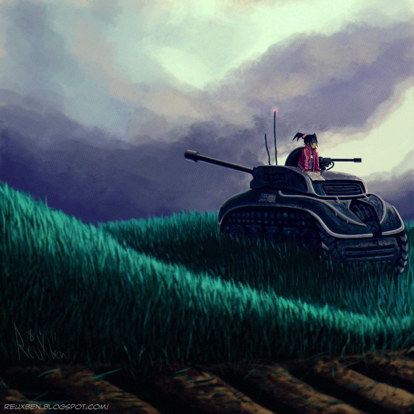
Here is Vicky Vasquez in a tank in a field studying a map of some sort.
I actually wanted to do a painting study with no linework, however not limited just to my usual SAUB, but my KNKL Chalk Brush, though I ended up using my Helen Chen Brush for the grass and tank texture. It started as a mood study of a tank, not a strict copy (just going for a similar mood), but then Vicky replaced the vague human figure in the study for more personalization.
I'm a big fan of illustrations that show characters on their off hours, the more non sequitur the better, so this felt like a great opportunity to just put Vicky in a quite random situation. So when she isn't reporting, maybe she's off driving a tank looking for treasure or something.
While I tried to keep this as one-layer as possible I ended up using just a few since the point was to keep it simple, but not add endless hours for unnecessary difficulty of adjusting this but not that, senseless repainting, etc. I'm feeling better about this, and I do credit the SAUB single-layer studies to being able to make this judgment. I guess it's like learning long division before you can earn the right to use a calculator.
This is the original version to the Dailies, but I didn't like how the cloud formation break made it seem like the gun was firing. While I was remodeling the clouds, I made a point to try applying some value stuff I'd learned to make the composition flow a little better, same with the bottom grass getting darker and snaking more blatantly to the tank.
Not normal,
Reuxben
I saw this striking BWR Steve Ahn sketch and wanted to try a similar take with Vicky since she's all about the black and white and red all over.
I wanted red to take precedence over the original's heavy blacks since that's her signature color, and it would distance the image a little more from Steve Ahn's, but I did want to see what a black treatment version might look like.
I've also been wanting to be super limited in colors, so I wanted to be sure to try a minimal, plain red version. Note the final has a memo she wrote to Fred.
Here's a plainer black version.
And here's where we tried to get a little fancier with the text.
Not normal,
Reuxben
Falling back to the old comfort zone with a quick Vicky V. sketch.
I just wanted to draw something in pencil again, after going back into pen and digital only for the past month while I've been offline.
I saw this technique online where it's mainly about overpainting, and thought I could try painting over pencils, to see how that goes.
This was actually our first attempt at that process, followed by an even looser attempt in that King Falls AM piece, which of course we posted first for maximum confusion.
This was just a series of escalations, which again, is why it's dangerous to try to do daily posts: I just wanted to draw something quick in pencil, but then I decided to render it a bit, then I decided to add some flat colors behind the pencils, then I thought I could try the quick overpainting technique, and then I thought I could add some graphical elements, and here we are.
Overall, I'm ok with this, and I feel like I am more comfortable using pencils as a strict base-concept, meaning I'm much more comfortable just outright discarding the lines during cleaning (I used the color dodge line-cleaning technique) and painting.
Eager to get to Vicky, but she's got to hang on for just a bit longer, even as of 5/4/17.
Not normal,
Reuxben
An older Vicky sketch back from when I was clearing out my last pocket sketchbook.
Not normal,
Reuxben
Doing some color studies and this is from a little foresty part of town.
Adding a character just to see how it might look to mix and match styles.
This was done with Steve Ahn's Ultimate Brush, so 100% opacity, but some pressure-sensitive width, though.
I really had to fight the urge to add some bells and whistles, but I feel I have to slug through SUAB studies.
For the final, I did add a gradient map to warm up the color a bit, but basically what you see is what you get.
Not normal,
Reuxben
A Vicky sketch after seeing someone wearing something similar at the station. My pocket sketchbook helps me be a little less precious, including live-inking the background with one of my lesser-used brush pens.
The background text is basically a summary of Coverage Draft's premise, written as illegibly as possible to still remain legible. I wanted to get wacky with the pose and kinda blew it.
Not normal,
Reuxben
One of my New Years' resolutions was to get a series of comics done this year, so I've begun doing just that, and this was a test run on my materials plus possible post-treatments, such as the straightforward cel-shader above, and the thematically colored shadows below.
I don't have the heart to go totally digital on comics yet, though, maybe I should do something micro to beat the preciousness out of me...
Anyway, I drew these with pencil and G-Pen inks on IC comics paper, and it was a dream...the drawing feels so smooth. I thought I could ink digitally, but...ugh...it just doesn't feel quite right yet.
So given these two floating figures, I thought I'd give them a couple rough color treatments, like some red-intensives for the "black and white and read all over" ethos (I don't anticipate any other colors in the actual pages of Coverage Draft), as well as full color.
Ultimately, I just went with the backgrounds I used for the tester images of Fred and Vicky for a kind of mock cover.
All right, I believe that'll do. Paper's great, inks are great, and we're all tested up and ready to draw some finals. Right now, I'm warming up on comics in general by drawing Splinter, but hope to have Coverage Draft under way soon enough, though probably want to do the other short first, too.
Not normal,
Reuxben