Friday, July 15, 2016

Fun_MyIdiotsInColor


Got my color photos back from the print shop and Nyao and Zero were even nice enough to sign it.


Here's the uncropped version, where you can see where the print shop colored over the negatives.


And this was before they processed the background.


They also sent me a spooky version that was lacking lines.


And then they even included the raw colors before all the adjustment layers.


And the lineless version of those unadjusted colors, too, how neat!

Reuxben

Wednesday, July 13, 2016

Fun_DomriNation


Oh, man, what a deal. Right now at 7-11, if you buy two bread items, they give you a free Evangelion/Godzilla notebook. Collect all four! I know I did!

[Not a sponsored post, I just like getting a free sketchbook every time I 7-11 it up...currently swimming in sketchbooks. Granted you have to be ok with the watermark and ruled lines, but I use these just for loose practice sketches anyway...minus these more involved Copic pieces.]


Anyway, this was the last page of my first "sketchbook," Domri Rade, the only MTG planeswalker I have any interest in as a character. I mean I read his lore stories and they weren't that gripping, but more just as a concept I find it interesting that a kid is a planeswalker. This betrays my bias against stories about adults, I guess, which I've discussed already, but basically, I can't wrap my head around adults not having everything already figured out, so who cares what their problems are?

On the art side, between you and me, I don't know why they give a certain artist all the planeswalkers, it seems quite unfair, even just on a numbers level, but also...well, I would not say his is the look to get. Tyler Jacobson, however just smashes it, regardless of whether or not he has a marquee card, notably see what he did with Domri Rade. I particularly love that orange glow in his ear for some reason. But in any case, other artists seem considerably underutilized.


For instance, Volkan Baga feels a bit wasted on monsters and stuff, especially as he is very much the student of master portrait artist Donato Giancola. And I'm still waiting on the Johannes Voss planeswalker--imagine a PW from the guy who brought you Thalia or the GP Chiba Sakura Angel. Min Yum could also do great if they'd just loosen up on the devotion to human planeswalkers--I can see something sinister-leaning, like the murkiness of Ashiok. Karla Ortiz, by the way, is also notably short in the PW department, though she's certainly killing it on legends. I guess, ultimately, some more diversity on PW artists would be swell.


Oh, and this was a sushi-themed admiral of some kind. Her outfit is sushi, you see...

Reuxben

Monday, July 11, 2016

Fun_TinazTacoz


I wrapped my 100-page pocket sketchbook from June, and this one of the the penultimate drawing: it's Tina from Tina'z Tacoz.

Reuxben

Friday, July 8, 2016

Fun_Flow


This is from a study session of stills from a movie trailer. I don't normally watch trailers, let alone movies, but I heard Radwimps was doing the soundtrack to an animu so I had to give it look.


To save focus during the week, I've been pre-posting a week in advance, hence the "12:01 am" publish times. So I'm hoping the emotion behind the coloring/design is alien to me by the time this goes live.


I'm hoping I don't even remember/understand what I'm talking about right now. But part of me never wants to forget these kinds of emotions because they fuel me.


Ah. Friday's our "big" update day, so might as well post a few more from the session. The through-line was that I wanted one red-tone in otherwise totally BW, landscape-oriented images, with limited hatching after the first image. Oddly enough this very topic came up recently...


I heard LeSean Thomas studied the first and last moments from movies like the 5th element to study composition, so I figured a similar approach might be helpful here. I only own two movies (Iron Giant and a Bill Burr stand-up special), so that might be a cool study opportunity.


This was the shot that started it. I saw this frame and wanted to capture that moment. Then I thought of LeSean's study and scoured the trailer for more interesting frames.

Reuxben

Wednesday, July 6, 2016

Fun_RainCoatCheck


I wanted to try something more designery, like this could be on a high-end t-shirt or something and rather than question it, people would just go with it.

Also, I love the rain, and it was raining that day. Just beautiful.


This was actually from a study session of some photos I saw on Deviant Art. This was also the first time I used my white pen to remove stray lines, but as I suspected, it indeed feels like cheating...

Reuxben

Friday, July 1, 2016

Fun_FeelGoodMan


Yeah, yeah, yeah, I'll pay, when tomorrow, tomorrow comes today.

I love Jamie Hewlett's work so I thought I'd leaf through my Gorillaz CDs' booklets for inspiration and this ended up being a live-ink study of a bunch of Noodle's outfits from the three Gorillaz CDs I have (the first two LPs plus G-Sides). The longer I looked at the G-Sides cover, the more I was intrigued by the color scheme they used, and thought I'd try to match it in Copics, and then all this happened, as they say.

So this is the scanned version of the piece, but as I suspected yet again, perhaps my scanner isn't up to snuff, especially compared to my camera...I had to adjust the colors extensively to get closer to what they look like in real life, but it still just has quite a heavy red bias. Colors aside, the capture itself is off...it comes out noticeably blurrier, especially compared to my trusty camera.


But speaking of my camera, this is Cammy's capture and it really does look a bit better, if I had to choose one (and I did). Once again, the camera gets closer to the actual colors I used, particularly on the skin, which here are closer to brown than red. Given how much the camera trumped my scanner here, I am a bit in shock--I thought my scanner was a tank--but it looks like my camera really is the stronger fighter.


I haven't scanned lines in a while, but I believe that and other BW work will have to be my scanner's destiny from now on, though these lines are via my camera. The only issue would be crispness, but that hasn't been a problem in the past. I wonder if the scanner is faulty and I never realized it...but I've had it since I came to Japan and don't recall it being poor before. Maybe the second move damaged it--I noticed the bright light doesn't pop up on the initial scan pass anymore for the preview capture (at least I think I remember it emitting a bright light during initial sweeps). Maybe I'm just not scanning correctly or something.


In any case, here is the process breakdown. A couple notable steps, this is my first time drawing on Copics. For the background, I knew I was going to live-ink it, so I thought I'd draw over the base color to prevent any rando ink swiping, though in retrospect, the G-Sides cover has even the blacks tinted red, so for that effect, I probably should have let the Copic tint the lines, too. But there was no smearing on the finely detailed areas so it wasn't all downside. Similarly, I realized dabbing rather than brushing color over finer inked areas like the jacket inlining helps prevent smearing.

The second notable thing is that this is the first time I've used colored pencils on a Copic piece. Not sure I'm doing it right, though, again, trying to mimic Eisaku, but I don't feel I'm getting as much punch out of them, especially on white. This is also the first time I've Copic'd over Copics, and using the pale red wash as a base was a little scary since some Copics seem to "spoil," or make this acid-ish texture emerge, and this indeed happened a bit on the grays of the railing, but after it all dried, it ended up looking fine, so crisis averted!

And lastly, I wasn't sure about putting in the white ink rim, but the G-Sides cover had that effect, so I went with it, though I do wish I had a thinner white pen. Mine's pretty good, but I am finding it can get a touch runny and after drying, it can end up washed out a bit. Owing to its thickness, it can also be hard to get to go precisely where you want. It also has a pernicious habit of clumping shut or getting streaks right in the line, so your carefully planned lines can get randomly thrown in danger (see the bottom right of today's piece). Still gotta crack open my Deleter white ink, maybe that's the answer...


To close, I thought I'd document the ever-important skin tones this time. I like trying out different mixes, and this was today's gamut, applied in left-to-right order. I try not to lean too much on "white" skin, and I've been collecting darker skin tones, to be sure, but there's definitely no shortage of expressive "white" skin available (heck, pretty much all the flat-out "skin"-named tones are "white"). The other photo is of a few of the colors I used for the rest of the piece.

And that is how we slow jam the news.

Reuxben

Wednesday, June 29, 2016

Fun_MyIdiots


My gosh, I love these guys...I call them "my idiots," but I love them. I saw them walking around the neighborhood, and had to stop them for a pic.

I was rereading some old comics from wiki-walking myself on Deviant Art after updating my ancient gallery there, and my gosh, I loved that series. Laughing out loud to my own stuff, how sad is that?

Reuxben

Monday, June 27, 2016

Fun_Flapper


Wanted to draw one of those bucket hats, and then the rest just kinda emerged.

Reuxben

Friday, June 24, 2016

Fun_CadetDeath


道かが世知辛いのか宇宙空間のほうがより危ないのことに関して、心配しないで。
あなたと一緒に私がいないのこと場合だけ、心配してね。
Don't worry if the streets are rough, and don't worry if space is worse.
Just worry if I'm not here with you.


Another experiment in watercolors and digital hybridizations, with narrative implications, as well.


This is the piece simply color-adjusted from the scan. However, I tried something new here: usually I just do auto-contrast/levels, but for this one, I tried biting the bullet and doing it by hand, and I kinda feel it looks a lot better. Imagine that.


As alluded to last week, our watercolor piece this time was on pure pencil lines, though again like last time, these lines are from 2014, but I do actually still like this vaguely Eva/Tenchi-inspired space suit. I wanna say I drew this after a Sukiya throwdown.


Here's the step by step, again using the same methods as last week, though (not pictured) much more digital processing afterward to give it some punchier colors, glow effects (learned from Algen!), and a more worked background. There was more liberal digital overpainting, too, again in that "image-making" philosophy rather than "watercolor-making."


And then some close ups. Good times...kinda want to splurge for the full-set of watercolors now, since after the next piece I did, I realized I'm just a bit limited in which colors I can finagle out of my little starter kits. I bought the three-piece intro "seasons" mini-sets, and while I'm happy with what I can do with them, I definitely need some stronger and softer colors. Though I'm sure a real watercolorist could Jedi-out all kinds of colors from what I have to work with.

The name of the piece, by the way, comes from Benji's nickname, and that "Cadet Death" sounds like "Cadet desu" in Japanese, which basically means "I am Cadet." A pun! The logo I made is inspired by some designs I made for HPB, all of which use the character 本, which means book, but for the purposes of that story was the JP counter for long cylindrical things. But that's another story.

Reuxben

Wednesday, June 22, 2016

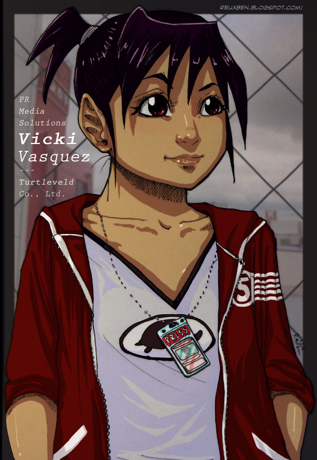
Fun_VickyV


"So, like, I'm thinking prolly photo op over there, yeah?"


Probably one of my favorite drawings recently, certainly of Vicky.

I drew it with my Signo .28 and decided to test their reaction to Copics, and the lines held up excellently.

Reuxben

Monday, June 20, 2016

Fun_ChillinCheon


Testing out my new T Copics with the Zebra Signo .28.

There was some smearing in the .28, but I like the texture it gives, like it's painted-on wood or something.

This was a warm up study from a still of Paul Cheon from Marshall Sutcliffe's Marshlog, which is chock full of excellent reference.

Reuxben

Friday, June 17, 2016

Fun_HeraldGirlSpecsUp


Green like dat moolah you ain't gettin', kid.

Seriously, though, tried getting into watercolors and coincidentally also into actually scanning color work rather than the usual photo snap. To be fair, my camera has repeatedly blown me away with how trusty it is, and I think it might, might be better than my scanner...!


Having always wondered which would win in a fight, I decided to investigate here (scan at top, cam on bot), and the camera does actually seem to be a bit closer to how the picture looks in real life; the scanner shows it a little more red rather than the brown it actually is. Plus the camera seems to be a little crisper...but I can't tell for certain. The main downside to the camera is that I constantly have to battle to capture the image straight-on (hence the varied sizes of the WIP shots) and properly lit (since all the light around here save my tiny desk spot light and my giant window during daylight hours tends to be more yellowish rather than white).

Anyway, today was really all about testing out watercolors (and color pencil touch ups), and fortunately I had an old piece inked up already, so I could cut straight to the coloring. And further fortunately, I diligently photographed the steps so I can "rewatch the tape" later to see what I did myself. I did watercolor earnestly a while ago, but kinda forgot whatever I managed to learn, though it's now coming back to me.


So these are like research notes, I guess: I started with gently layering in the tones I wanted, and placing in light-to-dark in the usual circular weavings and soft swipes for larger areas and subtler incorporation, and then used my waterbrush dealio to work the colors together piece by piece. I'm going mainly off of instinct since I don't have Internet most of the day, so hopefully this is in the ballpark of proper watercoloring.


And then I basically just repeated that process till all the colors were in. I then went over like Eisaku with some color pencils to bring some warmth/balance to the colors, and finished everything off with white Signo highlights. I should note that the line inks were with my G-Pen, so I noticed they can run into the colors a bit. My next watercolor piece was on just pencils, and it came out quite a bit cleaner, as expected. After that, I have to test my Signo .28 and my Copic and Micron pens, too. I assume the Signo's gonna get gnarled up. Wonder if Copic markers are wise...I'm sure there's some chemistry involved here I should be aware of.


Also worth mentioning, for the final PhotoJam, in the spirit of study, I embraced the concept of "image-making," so I touched-up the piece quite liberally in Photoshop, including moving some stuff around. I used to think this was something like cheating, but if I consider it not a watercolor piece, but an image I'm making--that is, a collection of pixels to display online--then I would like to see what I can make of it if everything on the paper was simply the base layer, like pencils to inks. Or paper to pencil! Taking the production further, I also used a KNKL-informed gradient maps and other effects, too, including some over-painting.

I feel like I learned a lot on this piece, even it isn't that great to look at (the date says I drew this two years ago!); the mechanics involved were quite worthwhile and I'd easily be down to give the image-making flow another go.

Reuxben

Wednesday, June 15, 2016

Monday, June 13, 2016

Fun_SleeveHerAlone


I dunno, I feel the main costume calls for short sleeves, but I like a long sleeve alternative.


Keep going back and forth. Just like Vicki vs. Vicky.

Reuxben

Friday, June 10, 2016

Fun_HowNow


Fred Roman concept from Coverage Draft.

Just something we're boodling with.


I like that Roman sounds like roamin', also has the core of romance, even man. Close second is "Broadsheet" or "Times..."

Anyshway, that's it for now.

Reuxben

Wednesday, June 8, 2016

Fun_Point28


So pumped to find this pen, the finest ballpoint I've seen yet, coming in at .28, called the "uni-ball Signo."

It rips with such a rich and beautiful line, just love it for sketching. The only downsides are it's not a click pen, so it's mildly annoying having to keep track of the cap, which is admittedly not too bad; and secondly, as I later discovered, more troubling is that this supreme ink has a tendency to smudge a touch even days after drying, which is a just a bit dismaying since I keep this pocket sketchbook in my pocket, where the sheets of paper tend to press into each other...you can see some light smearing even here in this fresh photo...

Still a lovely pen, and virtually ideal for traditional sketchbooks not being pocketed around, just have to make sure not to land hands on your lines during the drawing, but that's what guard paper and planning is for.

Reuxben

Monday, June 6, 2016

Fun_Tourist


Z is on the road with a new haircut or just an amnesiac hair stylist, to kick off my new pocket sketchbook using my new mini-set of color Sarasara ballpoints. These are great. But the pen selection gets even better...

Reuxben

Friday, June 3, 2016

Fun_VVPMS


Internet's back up, but only kinda.


In any case, I believe...


We're in the ballpark with V.

Reuxben

Wednesday, June 1, 2016

Fun_TwoTowers


If all went according to plan, I'm now in my new place, back in Tokyo.

Do I have Internet yet, o automatically queued update? Who knows.

Reuxben