A dark and spooky night indeed.
I drew this on a really tense night.
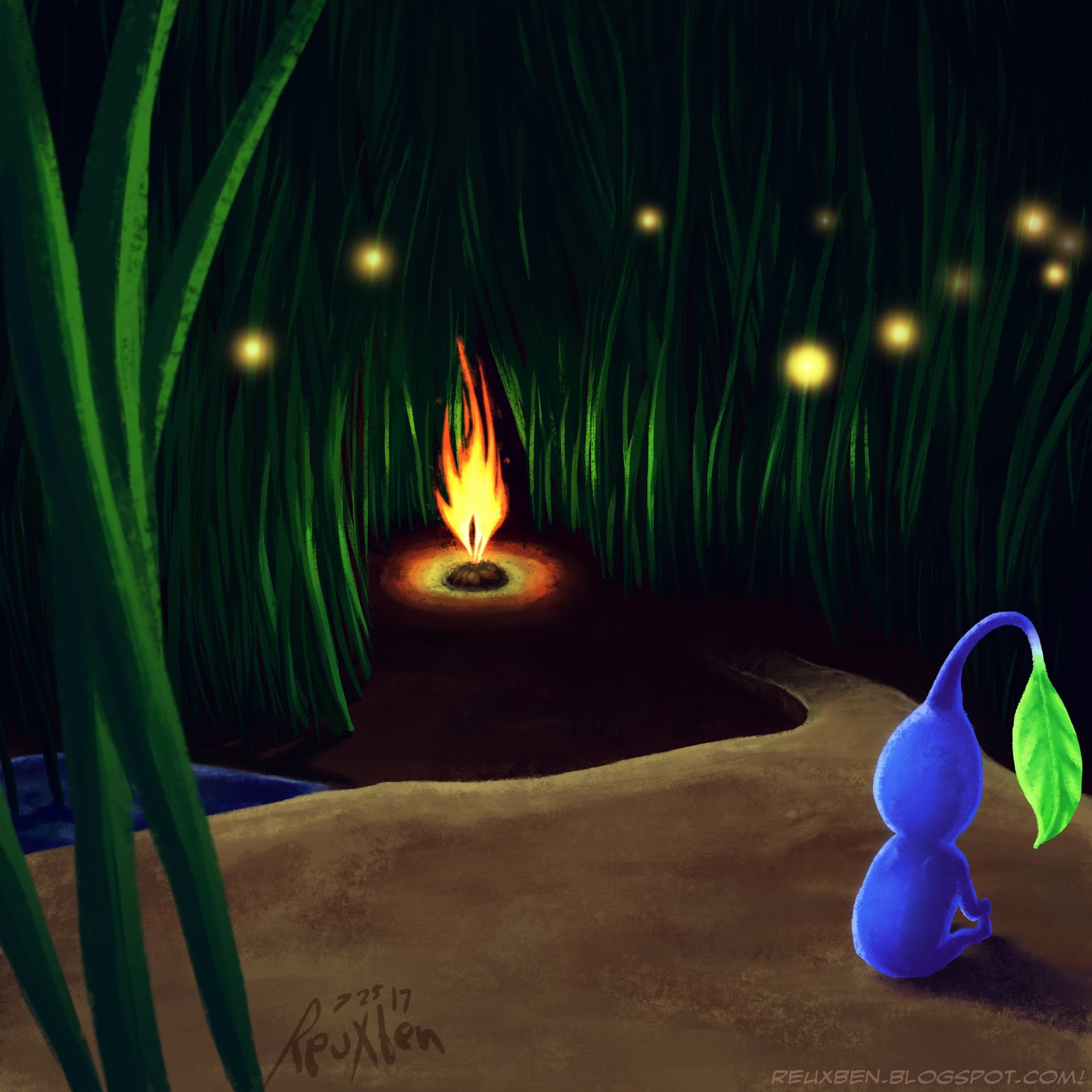
The blue pikmin is not longing to venture past the fire into the tunnel beyond, he's weighing the merits of jumping into the fire.
We were waiting with scissors at the ready just in case, at least I was.
But everything just went on fine (enough).
Not normal,
Reuxben
A Splinter concept.
There's actually a super subtle reflection of Didi hiding in the green.
This ended up looking a little like those CG French-based anime, like Code Lyoko, at least on this screen.
But I just wanted to do some cel-shaded coloring with Didi.
Not normal,
Reuxben
Again, striving not to draw water, but stumbling into the similar sparkle trap, I did a little night scene, starring the moon.
I am always frantically scrawling for ideas when I start these "single layer" runs, so I superimposed an early, abandoned sketch over this finished picture and it made for a neat, guardian angel sort of figure, really transforming the piece.
But the beginnings of this illustration were simply that I wanted a couple to be falling apart in a grassy field at night; the guy was fading away.
I ended up deleting the guy entirely, leaving just the girl to stare up at the sky alone. It felt more dramatic and more widely interpretive.
Painting stars is fast becoming one of my favorite parts of night drawings.
Not normal,
Reuxben
I wanted to draw my dudes in Fourth of July-inspired outfits every day in July until the holiday, so this was Alexis Blight's run. I've always wanted to do themed outfits, but I recently saw an ad with some neat US flag style stuff, and the month/holiday felt like good prompting anyway.
I was eager to draw specifically Alexis Blight because it's been a while, and the last one wasn't so great.
Since she's a bit on the meaner side, I thought she might be a little more antagonistic in her shoot, like even when everyone's having a good time, she still just has to make a little dig. They're on the same team, but she's gotta be a slight jerk about it.
But another reason for this series is because I also wanted to reclaim my patriotism. Things have tanked since the election--even before, during the campaign--and it's made me feel even shame of being from the US. But I love my country and am proud of what it is, should be, and represents.
It's been hard to be proud of my country lately, but we're going to get through this monstrosity and I do suspect we'll all be better for it, and banish those evil beings and forces strangling our national identity at long last.
I'm writing this as of 7/28/17, the day the Senate's "Skinny Repeal" bill died, meaning the Affordable Care Act is seemingly safe for now. The deciding votes were from rank-breaking Republican Sens. Collins, Murkowski, and McCain. A happy, proud ending to a horrifying story.
Not normal,
Reuxben
This is like our Spritely Going piece, in that we started with a landscape, but felt compelled to put a supernatural figure in there, too.
I wanted to draw a glacier, but in the end, it felt a little too unexciting, so I thought some kind of spirit-like figure that could have any range of good-evil morality would be cool. Might have been subtly inspired by when Aang goes into the Avatar State at the Northern Water Tribe, I'll bet--I recently spotted my copies of Rufftoon's old Water Tribe volumes, so that could have been why water spirits were on my mind.
For added punch, I wanted a decoy figure to contrast focus, so I added a moose-ish guy. I believe this (and the icy theme overall) was driven by my coming across a band called Pup literally day-of or prior to this drawing--not to mention, my disdain for summer and love of cold/winter weather probably played a key inspirational role here, too.
Yes! In fact, I remember--they kept coming up on the Youtube recommended list while listening to other music, and "pup" is one of my favorite words, so I finally decided to give this video game-styled video a try--was thrilled--and explored a few more of their videos.
Notably their song, "Dark Days," was incredible. They were so great I actually watched those and their kid adventure videos, too (usually I just listen and don't actually watch music videos!). Anyway, they are apparently Canadian, hence moose.
Not normal,
Reuxben
This one came about because, again, I strive not to fall back into drawing water, so rather than a desert, I tried for a forest with a spritely figure.
While wanting to do more than a landscape here, I wanted to avoid using a straight-up figure, so rather than a firm character, I tried something more abstract, perhaps inspired subconsciously by Eidolon of Blossoms.
This also entailed using my texture brush alone to sculpt the figure, just swipes of color, no actual linework. This was quite a change of pace.
Once we had a forest elemental duder, I wanted to see if I could lend some storytelling by having its feet spur flower growth. To contrast this, I pulled color away from areas it hadn't stepped on, which also had the benefit of darkening the values around the figure so it could contrast more.
I suspect I'm falling into a new "water" trap of adding sparkles a bit too liberally to scenes, but whatever, this piece was pretty much all experimental.
Not normal,
Reuxben
Since Wile E. Coyote, I've basically always rooted for the villains in shows, and Team Rocket was one of the legends, hence Jamezu.
Wasn't sure which Poke to put in place perched upon his personage, but I went with Chimecho since that's the last main I recall him with before I moved to Japan and lost touch with the show.
I remember how charming Chimecho was with him, so I wanted it to sorta be cuddling with him.
This actually started with the background as a separate piece, but halfway through that, I thought I'd love to draw a summery Vicky/Fred over top.
But realizing people only care about fan art, I started thinking who I could "cast" to star in the piece in lieu of my guys.
I've always loved James and casual fan art pieces showing characters more on their off hours than in more usual circumstances, so that's why we went with Jamezu.
I do feel in the end, the background didn't quite go with the figures, but I'm happy with it independently, though I added the trees after it looked a little bare when combined with the figures included.
There was the issue of worrying about making James look too white, since I'd be default lean him vaguely Asian since he's a JP IP, but meh, it's whatever you want.
The background was a thrill, though, because at random intervals I'd drastically warp it from its more uninspiring origins as a straight-on beach.
Not normal,
Reuxben
Revamping the old 27 piece. Completely re-inked it digitally, even.
Not normal,
Reuxben
Ok, here's an experimental one. Originally there was going to be a giant dragony creature in there with like a house/factory on or built into its back, but then, curveball, I thought to try alieny/sci-fi-y text. You can see some of its shadow in the center there, that darker brown.
This started as just an effort again, to avoid using water, as I feel it's a crutch I lean on when drawing landscapes. The total opposite of the ocean might be a desert, so I went with something sandy.
The text was originally going to be some sci-fi-ish light-based structure come from the sands, and then, again, to spur innovation, I rotated the structures, it looked like text, so I went from there. The structures made of light might have been inspired by Lost in Arcadia, a book I was reading by my old classmate, which opens early on with a similar concept.
The smaller text is just more manipulations of the larger text, chopped up and rearranged. Since the image was going to be a bit overshadowed by the text, I got to experiment with some different layer styles, like a radial motion layer set to overlay or something like that.
Not normal,
Reuxben
This was another improvised, single-layerer under a tight deadline that relied on random colors to guide me more than anything.
I did know I wanted to paint a red or otherwise unconventionally colored sky, ideally using a lot of heavy pinks.
The train/monorail was inspired by the monorail ride I took during one of my very first days after moving to Japan.
Not normal,
Reuxben
I wanted to try an experimental quick-painting over some old lines.
Again, I love the Oakland A's color scheme, so I am always happy to incorporate green and yellow (and white) into costumes.
This was just an exercise, but I'd say I came away with some more understanding, so...worth?
Not normal,
Reuxben