And then another study from the Pierce the Veil documentary to close out our little sketchbook!
Vic was swinging a light saber around for some reason.
Anyway, on to the next sketchbook now, I s'pose.
4/14/16
Reuxben
Another study of a shot from that Pierce the Veil documentary.
4/14/16
Reuxben
Found an odd little charm to this doodle. Probably informed my zombie designs, though I'm pretty sure I was thinking of Noodle's design from Gorillaz, at least in the back of my mind.
4/14/16
Reuxben
The antagonist to the little mystery adventure dealio was Geralf and this was his profile pic concept sketch.
Had a lot of fun with the background window's light effects and zombies. Finally getting to put those KNKL lessons into effect, feels great, but worried I'm messing up my back from how I keep finding myself contorting when I use the tablet...I don't get why this is happening all of a sudden.
4/14/16
Reuxben
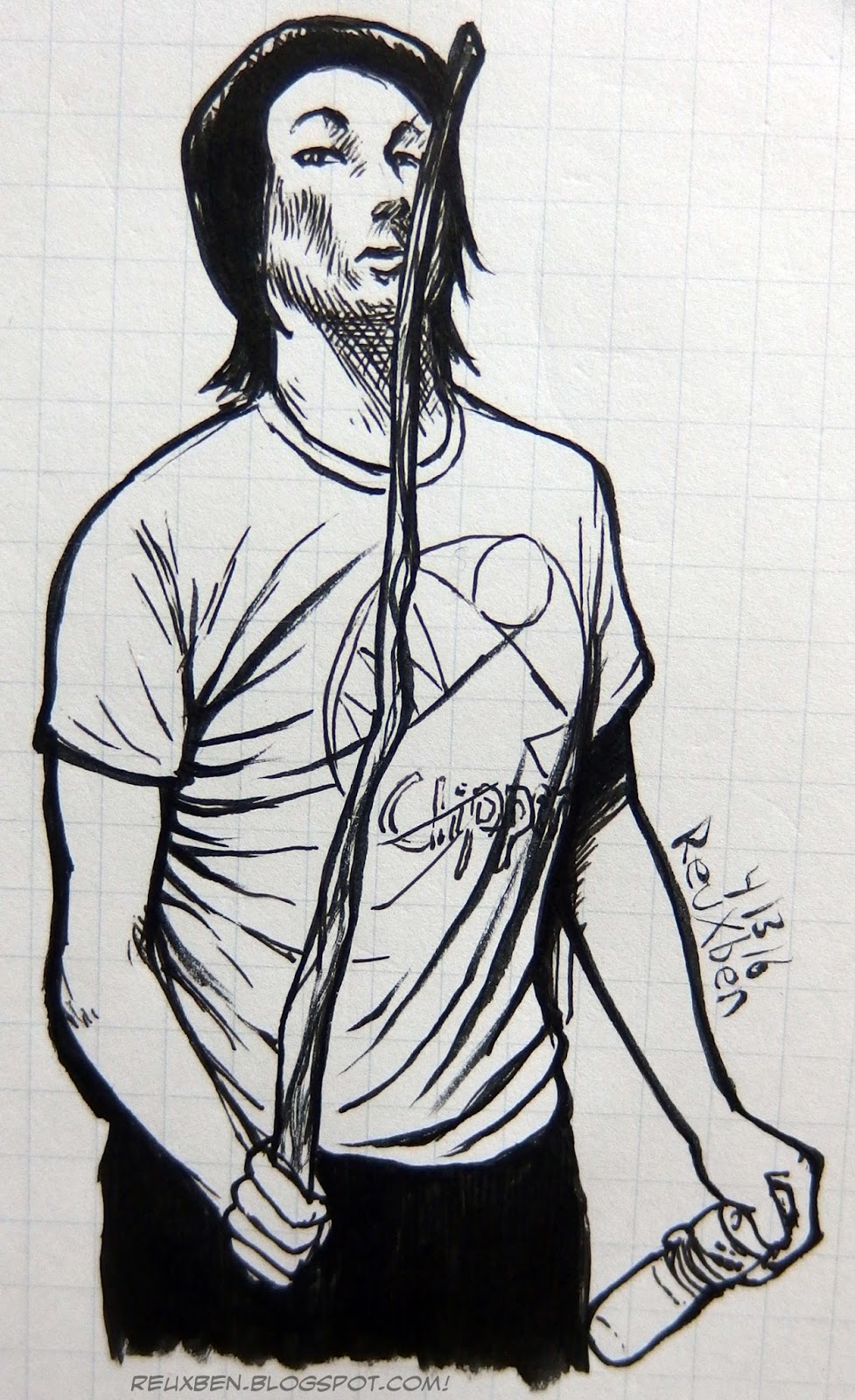
And another neat shot from the Pierce the Veil documentary study session.
Only one more page until we kill this little pocket sketchbook!
It's been a nice run, all for the low, low price of 119 yen!
4/13/16
Reuxben
And then the colored version of our Pierce the Veil Beatstick sketch.
Not sure which colored version I prefer, actually. I like the skinless style, you know.
4/13/16
Reuxben
Another study from that Pierce the Veil study of interesting poses.
4/13/16
Reuxben
Oh boy oh boy, on to 2016! We're in the home stretch on catching up with our backlog!
This is the colored version of our Vic sketch.
I love these green tones.
4/13/16
Reuxben
Studying a documentary I found of Pierce the Veil, drawing out the neat poses I saw.
This was Vic and his guitar.
And we're officially caught up on 2015!!
4/13/16
Reuxben
A little concept sketch for a mystery/puzzle themed project based on Innistrad and Zendikar.
Plus the extended edition hyper remix HD turbo ultra.
4/13/16
Reuxben
And a Merry Christmas it is--our little Wraith just got her wings.
Again the throat armor took inspiration from Algenpfleger's Solider token, but other than that, just hardcore riffin', especially on the bg. I chose to make the armor designs vaguely based on the letter M, for Markov.
I couldn't have this token fully colored for the SOI prerelease since I needed to pull this peculiarly rare token from one of my packs in the first place. Once I ripped one, I kept it BW for the event since I didn't want to present a half-colored, not-yet-ready-for-prime-time token, especially when the others were all fully colored up or BW themselves.
4/12/16
Reuxben
I decided to color our little experimental letter sketch, from when I randomly bought ice cream for everybody in the share house, all of whom I didn't know.
I used to do stuff like that in college all the time, just randomly leave people snacks and stuff because I'd often win contests in my residential college for free food at the student dive or I'd have spare grub stored up from Commons or the Law School.
I don't like talking to people, so I express my humanity and affection in nonverbal ways, typically through art but also frequently through gifts.
I like art.
I got to eat all that ice cream myself.
4/12/16
Reuxben
I found a draft of an old letter I wrote to my neighbors at my old place when I randomly decided to buy everyone ice cream.
I thought it would look funny to draw right over it because I used to be so precious with paper and stuff--never draw on lined paper, keep everything nice and neat, etc.--but meh, just cut to the chase!
I'm in a letter-writing mindset lately.
4/12/16
Reuxben
And then the base colors for our little wraith, as I've been calling her.
I had to call it a night when I was coloring this so I just roughed in the bg there, and hoped I would be able to remember what I was going for later on. We'll see how that goes soon enough.
4/12/16
Reuxben
Hum! Found the lines from ye olde Ichabod Fae piece.
I remember the shape of the overshirt was one of the funner parts, including those scarecrow-like frayed parts.
4/12/16
Reuxben
Another ad thingie I made, with the JP swapped out for some neato lyrics by TV on the Radio. Originally it was about a little viewing station you could watch old Pro Tours and stuff at.
And no, I'm not a Breaking Bad fan, I just like this song, and later found out it had some kind of BrBa tie-in.
I tried watching it, and it was so boring! I was like, this is what all the hype is about? It was like Hal sitting in a living room while a lady was talking incessantly or something and he was miserable having to listen to her(?)...I remember he had a briefcase or something that he was preoccupied with.
It was a while ago. Man, was it back in the US? I can't imagine I've had any opportunity to watch Western shows in JP...don't even have a TV.
Anyway, cards we used were--last call for guesses--as follows:
See Beyond
Propaganda
Evermind
Unblinking Bleb
Easy, wasn't it?
4/12/16
Reuxben
Studying Algen's soldier token's armor a bit for this Vampire Knight token.
I loved these guys at the SOI prerelease, but couldn't prep any before the event since this was a brand new token type!
Oh, I'd torn up some vampires from KTK, but only before realizing SOI's weren't 2/2s, and they didn't fly.
I ended up drawing this while waiting for day 2 to start.
Colors coming right up, just wait your wraiths.
4/11/16
Reuxben
You ever have one of those lifetimes?
4/11/16
Reuxben
This guy won a Pro Tour! But he's just another dude.
Dude, everybody is just another dude.
You? You're just another dude.
Me? I dunno.
4/11/16
Reuxben
Ah, man, one night on the train I saw two people just knocked out together on the train.
Melted my cold, unfeeling heart.
Or so my programmers tell me.
4/11/16
Reuxben
Was not expecting to enjoy this one so much, but it was actually quite nice going. I wasn't in love with the lines, to be quite frank.
Anyway, would not be ashamed to plop this homie down.
Psych! As if I ever get to play Magic any more!
4/10/16
Reuxben
And since I wouldn't feel right just stopping at Eric Canete's inks, I thought I'd try some monochromatic Copic tones on top of the lines.
This is the kind of piece you just get lost in, it was like 3 or 4 or in the morning, and I'm listening to old MTG Potpourri episodes and thinking about life and everything, working on this quasi-abstract design. What even is?
Anyway, another reason I admire him is because he's also a Copic artist. Inks and Copics with a resistance to digital. How about that.
4/10/16
Reuxben
A study of an Eric Canete sketch.
He actually inspired this site, you know. My gosh, we just hit the 9th anniversary of this site a few days ago, and a large part of it starting up in earnest was this guy posting such inspirational ink stuff that I'd study to get amped before doing an ink illustration for the Penny Dreadful.
I actually called this site Removal because he called his Discard! Haha. In Magic, removal is my favorite thing you can do, so it fit for multiple reasons--obviously there's more to the name than just that but it was a great jumping-off point.
I remember being so nervous when I finally met him...I got him to review my stuff at Comic-Con once. I was expecting him to shred me apart, but he was actually quite positive...somewhat vexingly, since I didn't really know how to improve from there. But I don't think he was pulling punches, he's certainly not afraid of letting you know what he thinks.
So...we continue floundering.
4/10/16
Reuxben
And the thrilling conclusion to our little study, adding in a rainy background because I love, love, love the rain, accented with the white gel pen for rainy bounces.
I find that when the gel pen isn't particularly crucial it seems to perform satisfactorily, but when we really need it to land, like on a rim, it doesn't quite get the job done. So the hunt continues for a reliable white ink, but fortunately, I have some white Deleter ink on deck I'm looking to try out.
4/10/16
Reuxben
Continuing the lil study, super reduced colors, just two tones per color.
I always overdo it, so this was a nice little exercise in restraint.
However, I had to kinda squeak in some extra color for the grayish blue since I don't have anything quite that dull, so I had to mix in some flat gray over a light blue. And then obviously I went a little Eisakusaku on the scarf. Love scarves. Schoolgirl uniforms not so much.
But man, Japan loves those giant wooden-plug-buckle "sailor jackets" I call them, don't know what the technical term is. And I love them, too. So cool, yet classic-looking, and guys and girls can rock them.
4/10/16
Reuxben
Studying the a ref the great Pomodorosa pointed out. I actually saw her artbook in the store one night and thought I owed her a buy, and it's quite an inspiration.
I'm trying to loosen up and not focus on matching exactly...I dunno how off this theory is, but I feel like worrying about being exact is not long-term what I should be after. I want to capture the essence, the spirit of the piece. Also helpful, I'm using pen a lot recently, so it's forcing me to make decisions, and stop worrying.
What, me, worry?
4/10/16
Reuxben
Hey, found an old sketchcard from one of my very first trips to Tokyo.
Drew and colored it on the Bullet train in, no major shakeups.
Lucky duck.
4/10/16
Reuxben
A study of Les Twins with as simple, flat Copics as we can.
My gosh these guys are incredible.
4/10/16
Reuxben