Showing posts with label Poster. Show all posts
Friday, January 13, 2017
FanArt_RestStop
This is a mock-up poster/cover for Rish Outfield's fantastic short story, "Rest Stop," which he performs solo on his podcast, "The Rish Outcast," while he's not co-manning The Dunesteef Audio Fiction Magazine or the That Gets My Goat podcast.
I randomly messed around with the snowfall layer and discovered a particularly spooky look here, which I could buy as a final, but it felt just a little too dead-on "horror." I didn't want the image to be too blatant; it had to feel mysteriously sinister, like a sinking feeling something bad might happen.
I initially started with the hag's mug looming over everything, but it just didn't feel correct, so I ended up abandoning this take after checking on and liking the hagless version. I like the empty space building suspense as you travel down the image, plus it allowed for a super subtle face in the snowfall.
Ultimately, it felt more important to emphasize it's the dude's story and the hag is only vaguely part of it, making it feel wiser to keeping her merely implied. The hood was briefly story-accurate brown, before going green-black to blend into the hair/forest/depths, so the hag does still survive into the final image.
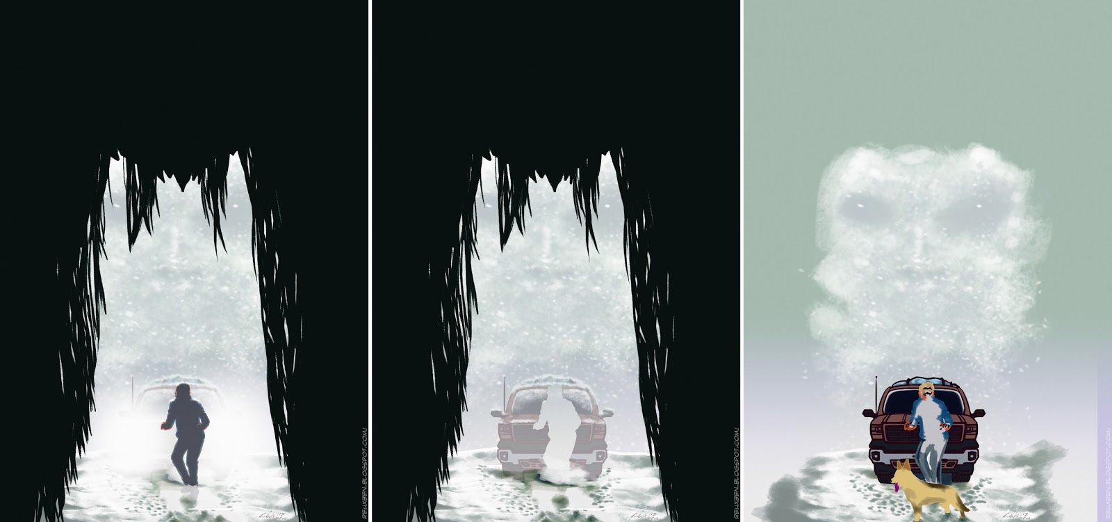
This piece involved a little unconventional processing for me. Normally I'd fully draw and color everything then go over with heavier core shadows, but this time, I just colored the rim lighting after getting the figures' structures down. Painting the snow was perhaps my favorite part, it's just so relaxing as always.
Here's the original sketch that started all of this. While listening to "Rest Stop," I kept envisioning a cool/creepy poster like this, and am happy to have been able to translate it into a finished piece. Rish Outfield is an excellent storyteller in the entire sense--that is, a phenomenal writer and performer of story--and his stuff really fires up my imagination, so I'm eager to try my hand at another story.
Not normal,
Reuxben
Tags:
Color,
Design,
Digital,
Fan Art,
Horror,
Illustration,
Making Of,
PocketSketch,
Podcast,
Poster,
Rish Outfield
Friday, July 22, 2016
Fun_DidiPizza
I knew I wanted to color this pizza box piece, and was on the fence about Copics vs. digital. I was on the heels of a Twitter deadline, had just seen a KNKL guide on photo filter effects, and was feeling more pressure than usual to go digital, so I decided to go in with some Photoshop, hoping to see how fast and simply we could color rather than paint. After posting to Twitter, with like a minute to go before deadline, I decided to bring it a little further, as like a hypothetical teaser poster for Splinter.
Here's the textless version. As far as bitter, bitter, inside jokes go, I should note I hate any permutation of the word "friend," and use such a word only with extreme care, if ever. I have allies and associates, mostly people/someone "I know" but I simply cannot use the f-word loosely. It's too dear.
Back on topic, here it's a little easier to see the duality that we played up to honor that theme of the comic. You'll note half of her is darker and the other half even has a phantom-y effect over it, lifted (albeit more subtly) from this old Didi PhotoJam.
This's what it looks like when we take away all the trendy filters, and yes, I'm actively practicing those effects...I don't normally embrace fads of any fashion, but I legitimately like the slightly gritty effects you can get.
Anyway, this was the Twitter version we squeaked in just under deadline. I looked aight to publish, but after the cookie of posting, I obviously felt the mouse to give it a little more.
Reuxben
Monday, March 7, 2016
Hare_Des.Under9000
A little ad I made inspired by Dragon Ball Z, text-free version.
Printed version has JP up top and Angloos on bottom.
It occurs to me this looks pretty (extra) ridiculous without the text.
4/18/16
Reuxben
Tags:
Design,
Digital,
Dragon Ball Z,
Fan Art,
Hareruya,
Magic,
PhotoManip,
Poster,
Work
Monday, December 14, 2015
Hare_Des.DawnOfTheLoser
Another ad thingie I made, with the JP swapped out for some neato lyrics by TV on the Radio. Originally it was about a little viewing station you could watch old Pro Tours and stuff at.
And no, I'm not a Breaking Bad fan, I just like this song, and later found out it had some kind of BrBa tie-in.
I tried watching it, and it was so boring! I was like, this is what all the hype is about? It was like Hal sitting in a living room while a lady was talking incessantly or something and he was miserable having to listen to her(?)...I remember he had a briefcase or something that he was preoccupied with.
It was a while ago. Man, was it back in the US? I can't imagine I've had any opportunity to watch Western shows in JP...don't even have a TV.
Anyway, cards we used were--last call for guesses--as follows:
See Beyond
Propaganda
Evermind
Unblinking Bleb
Easy, wasn't it?
4/12/16
Reuxben
Monday, November 30, 2015
Hare_Des.LetsRewind
A design piece I did. I swapped out the Japanese for some slightly less nonsensical English.
It was themed on memories, since the event was about writing down your memories of the past year or some such.
The cards we jammed here were (last chance to guess...ok here we go):
Time Walk
Island
Secrets of Paradise
Breeding Pool
Brainstorm
Memory Jar
and
Watery Grave
as the beaver.
4/11/16
Reuxben
Friday, May 17, 2013
AV_anp.iScream_Preview
I try and try, but the only thing I do? I scream.
We've got a rough patch...will update when we can.
Reuxben
Friday, May 10, 2013
AV_anp.BurgerFool_Doods
Tags:
Character Design,
Color,
Making Of,
Markers,
Poster,
Visual Aides
Friday, May 3, 2013
AV_anp.BurgerFool_Doodads
Reuxben
Tags:
Character Design,
Color,
Fan Art,
Mario Bros.,
Markers,
One Piece,
Poster,
Visual Aides
Friday, April 26, 2013
AV_anp.KappasLock
The primary poster is here.
I didn't have any pics of the final board, but this is the only joosy part, really.
You can see the featured segment here.
This month's anchor is my favorite jCreature, the Kappa.
a
process
of
Copicking
this
guy
up.
I
got
to
really
get
in
there
with
the
greens.
And
contrasting
this
with
earlier
Kappa,
I
feel
I
got
better
with
the
stripes.
Here's
a
making-of
the
piece
at
large.
Reuxben
Tags:
Character Design,
Kappa,
Making Of,
Markers,
Poster,
Visual Aides
Wednesday, April 24, 2013
AV_anp.KappasLock_Doodads
These are the inks on it. The design was inspired by Monster Hunter Epic, a manga I picked up a while ago and whose style is incredible. I love the Wayne Reynolds-esque, bulky armor style Monster Hunter seems to have, where the armor on characters seems to be a tad bit unrealistically cumbersome, such that you wonder how they can actually fight effectively in their gear. It's not terribly practical the more you think about it, but it looks so cool. So this was me trying to emulate that, plus Monster Hunter's tendency to have fur puff out of armor at every possible chance.
Here a section on goofs. It's a lighter version than the main poster since we simply have less space to work with on the secondary posters.
This is a little, literal Easter Egg I left on the back of the poster. If you find it, you get a fabulous prize. Nobody found it.
Reuxben
Tags:
Character Design,
Making Of,
Poster,
Visual Aides
Friday, April 12, 2013
AV_anp.Foolie
Here is the final main April ALT poster, including a spotlight on traditional US gags, Groucho, US comedy styles, a simple joke, a Truth or Dare demo, and an Easter corner. For a breakdown of the incidental doodads of the poster, go here.
This is a walkthrough of coloring our anchor image.
The walkthrough of the facial area is here.
I am not sure how the gag flower would work in this case, but just go with it.
The pose, if you caught it, is modeled after Groucho's famous cigar-twiddling one, like the pelican and the pickles, but with the Shyamalaian twist that it's not a cigar but a bill on a string that's being twiddled.
Also, the Joker thing was a reference to the use of that word in Japanese society for seemingly arbitrary reasons.
You'll find the word "Joker" on things that have nothing to do with comedy or light-hearted things, like there's a men's fashion magazine called "Joker," when it should be rather be called, "Expensive Things Nobody is Ever Going to Buy-er."
Of this one cooking manga called "Hungry Joker."
Nothing to do with the concept of the joker as we know it.
I think it just means a "cool guy."
Anyway, here it doubles as actually applying to comedy, too, so hopefully Japanese people learn something about the proper usage of the word.
Or not.
I get paid either way, all the same.
*Rimshot*
And here is the "staff" photo for this anchor. Fun stuff.
Tags:
Holiday,
Making Of,
Markers,
Poster,
Visual Aides
Wednesday, April 10, 2013
AV_anp.Foolie_Facer
Here's more from the main April ALT poster.
This is a process of the anchor image's face.
It was fun drawing a girl with a mustache.
I drew groucho glasses before, once, and I remember it was fun then, too.
Anyway, now we have copic technology.
Here's a breakdown of coloring in the head.
I tried stacking these images vertically so that they can appear larger here by default.
But it leaves a lot of space to fill here.
So I'll say that I just got some new yellows for this one, and I was pumped to use them.
The other thing was, like I mentioned, I was excited to use the Groucho glasses symbology.
And one of the coolest thing is when a girl is unafraid to be goofy.
So that's why we drew her being goofy.
Does that make sense?
Anyway, the styling was inspired by Harley Quinn, which is why the shoulders--well, we'll get to that next time.
I did spend a lot of time pondering coloring half her hair black, half red.
But I couldn't convince myself beyond reasonable doubt that such a color choice was wise.
So I backed out of it and went on a purely Harley Quinn route.
This was also fun--drawing money. Luckily I still have a US one, five, and ten in my wallet, which I was able to use as a model.
I didn't go as detailed as I would have liked for time limits, but it was still fun. I kinda wish I hadn't used such a bright green, though--even though a real ten is more pink than anything.
And the whoopee cushion! That was really fun coloring, perhaps because red is such a bold, dangerous color; it's really hard to mask red errors.
Tags:
Character Design,
Making Of,
Markers,
Poster
Monday, April 8, 2013
AV_anp.Foolie_Doodads
Here are some doodads from our main April ALT News poster.
The theme was comedy, so I was excited to share some light information on comedy. When people say "comedian," I feel like they mostly mean a "humor-based TV personality," rather than somebody who stands in front of a crowd and tries to make them laugh via monologue.
As it was April Fools, I also showed them how to do traditional US pranks. I did a mime demo for elemkids and they really enjoyed it.
I also added an interactive part of the poster, where you can spin the Pocari Sweat to learn how to play Truth or Dare.
Here are some headings that I thought came out pretty neat.
Plus there's a simple little joke, illustrated to boot, for easy Japanese consumption. I was pumped to learn from a jKid that he actually got and laughed at the joke!
Success!
Something neat I learned was that Japanese people think "Punchline" is Japanese-English, rather than English-English. That was kinda funny, itself.
I wonder if anyone understood the Groucho part, though.
Anyhoo.
Reuxben
Tags:
Design,
Markers,
Poster,
Visual Aides
Friday, April 5, 2013
Wednesday, April 3, 2013
AV_DontPlay_Bang_Preview
Tags:
Fan Art,
Poster,
Preview,
Visual Aides
Monday, April 1, 2013
AV_DontPlay_DontLook_Prev
Tags:
Fan Art,
Poster,
Preview,
Visual Aides
Friday, March 29, 2013
AV_anp.EmoKidz
I finished this right around closing time, hence the nightshot photo. Consequently, I can't remember what doodads I had here.
This was kinda inspired by last year's finale poster, in that I wanted to capture a slice of possible reality. More on that here.
I can't remember why, but I decided not to track the process as closely on this one, so not too many process shots, unfortunately.
For example, here's the process of the dude character. His hair ended up a bit too Final Fantasy...
The girl character ended up looking a little too ice-queen.
I wanted here to look sort of like Terra in that final episode of Teen Titans, aloof and oblivious to the guy, but she's just too distant.
The uniform swirl into mist was ok. Wish I had a deeper black-substitute. I try not to use pure black, so I have to make due with C-7 and maybe mix in a super dark blue or purple, but need something better...
Here's how our two characters meet. To help these two pop, I had the background reduced to basically cutouts, silhouettes. I liked the effect, but wish I could faded them out a bit more. I was right up on the deadline on this one, so I just had to tear in with pure black markers and pens, but if I could do it over, I'd try a light gray wash or something, with a light blue to push the background itself further back.
This is what I call the "staff photo," and I love that feeling of finishing a piece and looking back at all my team who helped me to the finish line. The paper I use to test colors is now packed with colors from future posters, and it itself looks kinda like an abstract piece.
Reuxben
Tags:
Character Design,
Making Of,
Markers,
Poster,
Visual Aides
Wednesday, March 27, 2013
AV_anp.EmoKidz_Pencils
The main school's poster is here and here.
This poster's kind of inspired partly by the final episode of Teen Titans between Terra and Beast Boy, but a lot by that Tenchi in Tokyo opening bit when Tenchi meets Sakuya in passing and neither realize who the other is/will be.
That scene has stuck with me since middle school and is perhaps one of the main reasons I love trains so much: they represent that sort of fateful/unwitting meeting of future ties.
I love that stuff.
Anyway here's a close up of our female lead character.
For this one I wanted to end the school year with a more realistic take since I usually don't draw people too realistically.
The previous year I had done riffs on students, but it was just for that one school, so to get some balance this year, I just went with realistic possible-students.
So this is not a real student, but I was using photo reference to get the uniform and hair style.
Here's a process of coloring the girl's face. I had just picked up some new skin colors and was pumped to give them a try here. Mainly super light E's, but I believe I had just read something about using light reds for more blood-rich areas like the ears and most noticeably the nose, so I was eager to try that here, but the red I had was still just too strong for my taste.
Here's the second part of the process I had also got a lighter brown since my browns were too intense for agreeable brown hair, so I anchored this on a brown called Campaign. I would go on pick up some more browns. The glasses were also a bit curious. I need some more black-ish colors. I heard a while ago never to color anything pure black, and I've stuck with that pretty well, but I'm not convinced I've cracked this.
Reuxben
Tags:
Character Design,
Costumes,
Making Of,
Markers,
Poster,
Visual Aides
Friday, March 22, 2013
AV_anp.CrossRoadShow
The pencil process is here. I don't have any close ups on the poster's doodads, but you can also see a Rillakuma if you look hard enough.
The art concept was two kids at a crossroads for graduation, influenced by Gerard Way's Akira-influenced capsule jacket emblazoned with the school logo. I love how each school has its own logo, kind of how in the US we all have mascots. But the graphical style of the different logos is pretty sweet, I love seeing new ones. On the train you can see different logos imprinted on school uniform buttons or patched on shirts, it's pretty cool. The crossroads here are Past, Future, Next, Adventure, and Big Time, kind of inspired by the semi-randomy One Piece signage you can see Oda put in his illustrations, but also the sort of old-timey signage you can find in Winsor McCay comics.
Sounded like a good idea at the time.
Reuxben
Tags:
Character Design,
Fan Art,
Poster,
Visual Aides
Wednesday, March 20, 2013
AV_anp.CrossRoadShow_Pencils
I already do these posters on large sheets of paper, so making these full page means this is the largest drawing I've done since...well, last year.
Reuxben
Tags:
Character Design,
Poster,
Visual Aides
Subscribe to:
Posts (Atom)


