Monday, June 5, 2017

FanArt_BaddestKid


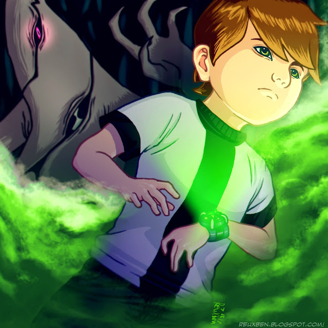
Man, Ben10 was one of my biggest early influences, so I was amped to do a Ben10 piece, seeing as my last full-fledged effort was seven years ago!


In fact, Ben's transformation into Ghostfreak was what inspired Deadboy's look, which surely helped inform Z's vibe. I definitely remember pausing the DVR frame by frame during the morph so I could get Deadboy's eyes to look just as rusted out.


To be more accurate I probably should have used Ghostfreak's wild form, not his post-capture look. And while I was at it, I should have gone for a different villain. My favorite is actually the Shaman dude. I remember hating Dr. Animo, though. He was so gross and his debut episode always seemed to give me a headache--I associate it with a hot, sapping summer day.


Anyway, since I've been in Japan, it seems there's been a million spin-offs, but that first series will always be special to me. The writing, the acting, the animation, the stories, it all just fired me up, particularly before they started getting to the universe-sprawling stuff. Just a kid on a summer adventure where weird, vaguely-interconnected stuff starts happening.


I do feel a little bummed cuz I copped out with this smokey, impressionistic background. I just wanted it to feel Sci-Fi-y and mysterious, with the focus on the characters and the moody atmosphere. I also tried to use more value control, as per KNKL's constant lauding of this.


Bonus round. I did try going for a fully-painted look, but scrapped it for more usual cel-shades. This is one of the better painted drafts in progress, but it just kept feeling more creepy/uncanny-valley than cool or anything, so I cut it.


Here's the initial, super-rough sketch. It was all about Ghostfreak stalking Ben, and only later in the coloring process did I realize it'd look a little cooler and creepier if Ghostfreak were bigger and almost cradling Ben's skull, while still pushed further into the background.

Not normal,

Reuxben

Friday, June 2, 2017

SLS_Helicopter


Float off into nothing, it's Sick Little Suicide #33, "Helicopter," in which we witness actual, global evil.

This image was inspired by the lyrics from Motion City Soundtrack's "Hello Helicopter," believe it or not, but the main theme was the "US" withdrawing from the Paris Agreement on Climate Change. I was thinking specifically of these lyrics:
In several years no one will care
They'll be rich and dead
So let somebody else devise a cure for it
The withdrawal from the Paris Agreement is nothing short of an evil, global act of spite. And for what? For the personal flight of fancy or vendetta of a vicious minority that either refuses to heed wiser heads, or is simply that bent on being as foul to as many Others as possible.


Assume nobody knows if climate change is real. Why would you gamble everyone away on the stubborn (or ignorant) assertion that you are right and cannot possibly be wrong despite your track record of being grossly, perniciously wrong on just about everything hitherto? What if you're wrong? If you take precautions and are wrong, what's the penalty? You get to lead the world in a new movement anyway. Isn't that good for a power fix? Why not excel in and lead the new industries that open up? Let's also assume you make less money from taking climate change seriously. You'd make slightly less money indefinitely into the future and command prestige and leadership versus make slightly more money for a finite period and experience deteriorating living conditions, prestige, and leadership. It's like the schoolyard hypothetical where a guy comes by every day to offer you a choice between a nickel and a dime. He laughs when you choose the less valuable nickel, but comes back every day with the same offer to see if you've learned your lesson; when you finally choose the more valuable dime he no longer comes around. Make a dime once or infinite nickels?

Let's assume all the experts are right. That makes this even more of an obvious choice: follow the advice of people who know what they're talking about. It's not any more complicated than that. In the same way you listen to what the doctor says without yourself having gone to medical school, or the electrician without having studied electrical systems, or the IT guy, or the skydiving instructor.


Fun Facts: With the Paris withdrawal in mind, I started this image by just throwing down slabs of color on a single layer since I only had about 40 minutes to work on this, but fortunately this illustration sorta emerged on its own. It was originally going to be a skeleton drowning in a flood of water, reaching futilely to the empty sky, but when putting on a final yellow-orange layer for more warmth (it was a little too arctic/blue) and toggling through layer styles, I got this neat, radical neony version that I thought looked pretty striking.

Easter Eggs: The skeleton is basically us eroded away into bare nothing and begging for mercy while being overwhelmed with the ocean. I imagined more literally in the scene that the skeleton's reaching for a helicopter to pull him up to safety, but not even that is there.


Full disclosure, I don't actually particularly care about climate change, but I have sense enough to understand the sheer magnitude of the consensus of scientists warning of danger. Not to mention the presented evidence is simply unassailable. I would not presume to know more than them, and that they're all warning of the same thing means any reasonable person should take the precaution and listen to them. Plus, it makes no sense to doom future generations if we have the chance to preclude their ruin now at no real detriment to us in the present and with the possibility of simultaneously opening new industries (and leadership opportunities) as we phase out the old, destructive ones. I see it like recycling: does my individual recycling actually benefit anyone or make a dent in any environmental problems? Who actually knows. But why not? If it's meant to be good and be part of a greater mission to help others and future others, why not do it?

And at the most gut level of rationale, if that Orange Fraud is staunchly anti-climate-change, that should be compelling reason enough to think the opposite--supporting the Paris Agreement--is the more humane, rational, and just position.

Not normal,

Reuxben

Wednesday, May 31, 2017

Fun_IslandHopper


Ok, yes, back into the old water trap, but hear me out, this time it's a desert forest swamp type deal. And there's a monster. Even a little short story!


The little eyes were a last touch that I thought might add to the scariness. I believe the bloody trim was improvised, because I was working with this new pair of textured brushes, which are simply wonderful for gruffing up a piece. I used the more drawing-oriented brush for most of this and then textured it with the more sandy dooder.


I also experimented with some half-tone accents around the border so it is hopefully not too traumatizing or intense, and falls more on the outlandish, fictional side of things. It's only scary if you really think about it, I'd say.


This was done on one layer, hence minimal making-of steps, but all the layer effects, blurs, etc. are of course loaded up on top.

Not normal,

Reuxben

Monday, May 29, 2017

Fun_MemsTheWord


I wanted to draw something for Memorial Day, and this WWII scene suddenly leapt to mind with only about an hour left on the clock.


I took scarce glances at references for the vehicle and rampart things, but tried to keep it as gut-fueled as I could from imagination...I believe that's called a "mood painting."


Plus I'm trying to get more comfortable drawing from imagination, since I tend to rely on references almost as a crutch.


This is how it actually looked with "my" colors, before tuning down the saturation and adding all the blur effects.

Side note: it sickens me that soldiers and civilians around the world are dying for and because of that Orange Fraud. What greater shame is there?

Not normal,

Reuxben

Friday, May 26, 2017

Fun_Knightbrella


Every day I try to sketch something and post it to Twitter and Instagram by midnight Pacific. Sometimes ideas don't really go anywhere, and I just improvise something else. Today are two ideas that stalled out and I pulled the plug on because they just didn't feel like they were working. This was a medieval knight sorta sketch.


This one was supposed to use sharp yellow, a bold color I don't really use much, combined with my love of rain and umbrellas. Again, this just didn't quite feel like it was going anywhere, but it's not so hideous that I'd DQ it from appearing on Removal. I tend to keep older drawings unpublished that I feel have potential down the road, and maybe I'll develop these a bit more at some point, but I dunno.

Not normal,

Reuxben

Wednesday, May 24, 2017

Fun_PossibilitiesThunken


I wanted to try designing something nonsensical over the digital inks I did over a live-inked sketch from a while back. I chose the name Laura because pretty much all the female editors of papers at Yale were named Laura, so it felt author-y.


I just wanted to dress up the lines a little, but the final, quasi-magazine cover treatment idea came some time after this draft sat for a bit. I just love drawing scarves and negative space, but other than that, this is just a totally random train sketch.


I inked this with a new brush I'd just gotten, that they say is great for inks, and I agree. It's super smooth and crisp, but I do like the slight grit from my trusty Steve Ahn's Ultimate Brush, so I generally stick to that one. I bet it'd look killer with Lazy Nezumi or at least a Cintiq.

Not normal,

Reuxben

Monday, May 22, 2017

Fun_Lakers


I guess this might have been vaguely inspired by my earlier "horror" sketch, but it was mainly because I listened to a podcast or an interview about the new Friday the 13th video game starring Adam Sessler.


I'm not actually into horror movies because they never scare me more than my own imagination. Side note, I am sick of hearing how great The Grudge and The Ring are--we laughed right through that stupid vocal-fry, five-hours-before-anything-kinda-happens movie. I love Japanese stuff, but come on...I'm not giving it a pass.


Anyway, I thought a neat gimmick would be for this Jason-y guy to have a green glove and a red glove. I presume each has different powers. Look, I just wanted to draw a lake/forest scene without relying too heavily on water since that's too much my go-to on these landscape paintings.


The only horror movie I really like is the first half of Jeepers Creepers. The second the reveal the monster after it gets hit by the car, it's like a totally different movie, and I totally check out.


Another good one is, what is it, Detour or Wrong Turn? Some car-related term. It stars Captain Stottlemeyer from Monk, as the trucker villain, and he calls the main character "Candy Cane" over a CB radio. Such a great performance. Apparently he played a more famous character I'm supposed to auto-associate with him from Silence of the Lambs, but I haven't seen it. Not really into movies...!

Not normal,

Reuxben

Friday, May 19, 2017

FanArt_Linkachu


I saw someone mention an online, in-browser auto-sketching program and wanted to give it a try. The idea is it builds a library of images for people to "autodraw" from, like autofill guesses what you're typing to complete the word, but this guesses what you're trying to draw and completes the drawing for you based on what it has in its bank of art that matches your mad scrawlings.


I wanted to give it a try but it was clunky, a little hard to work with, and was more meant for lineart--the colors I added here were mainly just big chunks of coiling lines filling the space I wanted to color. But the deal breaker was that it froze up on me and so the Link I drew got locked in that state, at which point I was done wiff dis.

It's a neat idea and has great potential for more designy or logo-y art say for posters around campuses and stuff, but it's currently unable to be pushed for more complex drawings. If they can ensure it doesn't freeze up and make it so longer drags don't move your selections of smaller lines or stutter the program, I could see giving it another shot.

Not normal,

Reuxben

Wednesday, May 17, 2017

Fun_VforTurtlePower


I saw this striking BWR Steve Ahn sketch and wanted to try a similar take with Vicky since she's all about the black and white and red all over.


I wanted red to take precedence over the original's heavy blacks since that's her signature color, and it would distance the image a little more from Steve Ahn's, but I did want to see what a black treatment version might look like.


I've also been wanting to be super limited in colors, so I wanted to be sure to try a minimal, plain red version. Note the final has a memo she wrote to Fred.


Here's a plainer black version.


And here's where we tried to get a little fancier with the text.

Not normal,

Reuxben

Monday, May 15, 2017

Fun_SpookieDookie


I'm writing this on 7/24/17, as I've been away from updating Removal for a couple of months...absent like a ghost you might say...so I can't actually remember all of the backstory to this. The main point of this site is largely so I myself don't forget what little details and inspirations went into the art I make, so joke's on me.


No real reason for a horror theme, but I remember I was short on ideas and the daily Twi/Insta deadline was close, so I just went with the tried and true random-color-blotches brainstorming technique that usually leads to an idea. I just stumbled on ghosts, which led to the haunted house, and then for a kicker, I plugged in a Jason/Freddy-type serial killer.


As I was uploading this, I remember precisely thinking, "Man, this is idiotic and unappealing, why am I posting this?," and yet this is one of my most popular pieces on Instagram. I still don't think it's that great, but whatever works, I guess.

Not normal,

Reuxben

Friday, May 12, 2017

Fun_Terradacto


I once worked with an artist who said that even though he puts out a regular amount of art, each with a little hype cycle to it, truthfully, he really doesn't like some of the stuff he puts out.


He said that despite his distaste for a particular piece he's not proud of, he still has to pretend like it's the greatest, hottest new thing, just the same as if it were one of the pieces he takes great, legitimate pride in.


The trick, he said, is just to treat it like any other piece, despite whatever you're feeling about it. Let people who like it in spite of the flaws you see in it like it, but keep your hatred of the work to yourself, try to learn from it, and move on to the next one.


This one was sorta just splotching non-green/blue colors on the canvas to see what would emerge, turned into an underrepresented desert scene, and then ended with plopping an aerodactyl-style creature in there. It didn't make any more sense at the time, apart from just wanting to paint stuff I tend to avoid, and avoid stuff I tend to gravitate towards.

Not normal,

Reuxben

Wednesday, May 10, 2017

Fun_Joongla


I saw a photo of a placid lady dressed in white standing in an utterly, overwhelmingly vast jungle, and wanted to paint something similar.


The red dot represents Japan, or love, both to be held close to the heart. I love using negative space, and this felt like an excellent opportunity to try some out--the person here is the absence of being, anyone can be here, overwhelmed, but clinging to what they love.


The version posted to Twitter and Instagram is just passable, but the final version for Removal features some additional post production: with these color sketches, I usually stick exclusively to Steve Ahn's Ultimate Brush on a single layer of drawing, but for the post production I used additional drawing layers for some "star"/dusty brushes for the jungle sparkles, and the KNKL Chalk brush for additional lighting effects.


I'm trying various blur combo effects, too, such as the motion blur at a totally vertical angle to give the trees more height, and a zoom blur to give it a slightly eerie feel, or at least so it's less strictly comfortable or peaceful as a happy-go-lucky forest scene. Another change up was when RGB shifting, I set the blue layer to a unique layer style from its cohorts.


Tangentially, I was also kinda inspired by Dance Gavin Dance's latest release, apparently a cover to a pop song called "That's What I Like." The idea of whisking someone away and making them happy is quite captivating. I mean, that's sorta ultimately the goal with art--take people away and make them happy.


Or something like that, at least.

Not normal,

Reuxben

Monday, May 8, 2017

Fun_FranceGo


I just wanted to try drawing something on super loose lines, almost jumping to overpaints asap, and this was inspired by the recent French election, where at long last evil lost.


So I just sketched in a super rough skeleton of a drawing and flatted it, then went to coloring and collapsing! the two in short order.


I then dropped some filtery layers over top and generally tried to keep it as straightforward as possible, with allowance for roughness and sketchiness.


I wanted to try drawing a darker skinned person, as I think it's kinda neat when you think about how much we abused and disrespected black people here, meanwhile when they went to fight in the war, they felt welcomed in France.


And now here we are looking to Germany and France, etc. to be the heroes, and we're stuck as some trollish villain for the time being.


But we'll get there. Related, I also wanted this to be a female here because I was also inspired by Sally Yates's utterly heartening, unflinching patriotism in the Senate.

Not normal,

Reuxben