Monday, July 31, 2017

Fun_AlwaysLurking


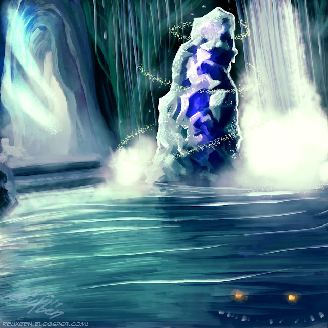
Ok, I wanted to try a quasi-fantasy landscape from imagination, so here's an Undergound Sea-inspired underground cave lake deal.


The pillar felt like a good spot to anchor the image, so I included some nominal fantasy sparkles around it.


I always try to push the fantasy of landscapes, so I included a little creature lurkingon the bottom right.


This was a fun exercise, too, as I was testing out some new Shaddy Concept brushes, which I found randomly from this post by Skraww.


These brushes are a joy to use, and I really love the mist brush. I'm thrilled with how well they allow me to just get into a flow. And while I'm happy with this as a nice sketch, I'm eager to see how we can push these brushes even further.

Not normal,

Reuxben

Friday, July 28, 2017

Fun_MingRountain


Ah! At long last, our little ring mountain painting is done!


I've been working on this for the past two weeksish (feels like forever), after having started the rough base sketch a few months ago, after being inspired by the Algen "mood paintings" concept.


The idea here was to do a "major" landscape from imagination using only Steve Ahn's Ultimate Brush (flat yet expressive), after having done a couple of "major" pieces with photo reference.


My goal was a sorta futuristic landscape with natural bridges to push the scene's fantasy. And yes, I fell into the water trap, but I love drawing water, man, it's so freeing. And the rock formations were also a lot of fun to sprinkle in there.


While I drew everything with the flat SAUB, I did want to see how it would look with a few blurs and RGB shifting, so that's why the final version has some of that, but otherwise, all flats, one layer. I did make some edits like ajusting some spikes' angles, but merged them into my main layer. The foreground ring is the only other layer, since it felt like I needed a darker value there.

Not normal,

Reuxben

Wednesday, July 26, 2017

Fun_MakingMing


This is not the final version, but I have so many steps captured of this piece, I decided to split the preliminary steps into this separate post.


The challenge here was to make a "major" landscape from imagination using just Steve Ahn's Ultimate Brush on one layer.


I started this piece back in May, but put it on the back burner after other priorities came up.


I kept thinking how this reminded me of Chocolate Mountain, from Super Mario Bros., which was a fabled area to me because that meant you were officially far in the game, near the end, past the kiddie parts. Bittersweet since you just want to disappear into that game forever (I'd replay that second level, with Yoshi, for hours). It seems like interest would fade by the forest prior to Choco Mountain, and the game never got finished, but hitting triceratops-having mountain meant you were past that crucial interest-fading forest area.


Anyway, my favorite part of this piece is probably the pale, faded mountains kissed with snow and grass in the background. To see how this piece winds up, sheck out it on here.

Not normal,

Reuxben

Monday, July 24, 2017

Fun_BuddingStudies


Here are some studies from across the ages.


Gotta be honest, man, I don't see the point of all this stuff...what am I gaining from this?


It feels like I'm wasting time when I could be working on "real" illustrations and comics...but Algen says to do it...and I trust him completely.

Not normal,

Reuxben

Friday, July 21, 2017

FanArt_VolleyMelira


Here is Melira, Sylvok Outcast hanging out with her trusty Murderous Redcap volleyball in classic computer RPG mode.


I love seeing characters on their "off time," so I wanted to do a series of Magic characters playing volleyball with volleyballs themed after something relevant to their card.


In this case, it's the classic combo of Melira and Redcap: just find a way to repeatedly sac the Redcap, and the redhead will keep it recurring to your murderous content since it can't get the prohibitive -1/-1 counter to stop it from persisting whenever it dies.


I had Jonathan Coulton '93's "All This Time" RPG video on my mind, so for a Magic version, the scenario was related to playing a combo deck and then recognizing that you can go off that turn to win, which was a situation I found myself in when I played a rare Standard FNM. I didn't have enough on me for the Modern Masters '17 draft (I was expecting an Aether Revolt draft), so I settled for the stupid Constructed tournament.


They let me borrow a "Copy Cat" deck, where you just try to get Saheeli Rai and Felidar Guardian to instantly combo off with infinite cats to attack for arbitrarily large damage (pre cat-ban, you have the Planeswalker blink the cat, the cat blinks the PW, and each iteration generates the additional cat you refresh the combo with). I often went through that thought flow: ok, I have the combo, do I go for it? Yes or no?


Anyway, I also did a more standard color Melira version. The trees were originally pink, like sakura, but I settled on going for maximum green. I had imagined these might make nice desktop wallpapers, so this is the standard color version.


And this is the minimalist-style wallpaper. I liked doing the computer screen effects on the PC version of this, including the reflection of a figure turning off the screen, so I think I actually like this style better...anyway, you can DL these easily on DeviantART.

Not normal,

Reuxben

Wednesday, July 19, 2017

FanArt_TwereScratchin


I did some sketches one night with the Tokyo Werewolf, and thought I'd fully color one.


Even the inks are digital here, and I just used the sketch as a rough idea, which I recall was inspired by Chopper from One Piece.


Eager to see what a full-digital version might look like, I added a little laser show featuring reds, blues and of course a prominent green.


The reds, whites, and blues are of course for the flags of the US and Japan, but also Yale. The RAF logo, cool itself and associated with the rocker movement in the UK, was great because it actually has a Rising Sun on the shirt, circled by a blue ring, meaning we have Japan and Yale as a common bond.


The disks he scratches also have Green and blue for Yale reasons (they even say Yale's original color was green, though I also heard this got debunked...). Anyway, there are a bunch more sketches we could develop, maybe next-level it with a smoke machine, too.

Not normal,

Reuxben

Monday, July 17, 2017

Fun_RadStudy


Man, can't believe I never posted this...this was a series of studies inspired by the Algen method. You have to draw black and white images based on "thresholding" images into black and white, so only absolute black and white remains...I gotta be honest, I'm not sure I quite understand it to this day, though it does sound like what one of my Yale professors was kinda getting us to do, though way, way, way indirectly...Anyway, I chose to study Radwimps music videos for these, like "DADA," "会心の一撃, and "ドリーマーズ・ハイ."

Not normal,

Reuxben

Friday, July 14, 2017

Com_Tortugatastic


Here are some concepts I did on the theme of "turtles and beverages," plus a couple sketches just for fun on the right, since I quite enjoy drawing shell-based creatures. I don't drink, so I'm just pretending this is juice. Juice. Hey, remember in Power Rangers, how they'd always hang out at a juice bar? I always wondered what the deal was there.

Not normal,

Reuxben

Wednesday, July 12, 2017

Fun_VDN


A painted sketch of Vicky Vasquez.


This started as an effort to paint with just the non-textury Helen Chen Brush. It has ever so slight blendability, so you can lighten up your pressure to blend, plus you can always "chop" colors together Cold Stone Creamery style.


The concept of her in front of a faded-out newspaper has been a treatment I've enjoyed for a good while.


Overall I'm happy where this illustration went, and I'm really liking how much you can do with just this one brush alone. The gray background was a bit of a gamble, but I wanted it to feel like a newspaper--gray, yellow, kinda dull unless that's specifically what you're looking for (hence the sharp highlights, representing purposeful searching). My name in Japanese is on the right, too...


I am not happy with the jacket here, however. The colors are fine, but they do feel a little too far from proper red, but the style also feels uninspired. I studied my nose and collar bones a bit here, so hopefully those are getting better.


This is the original sketch I bolted out way too quickly. But again, this brush is just great for getting ideas on the canvas, while still being able to go back in and noodle away when you have time.

Not normal,

Reuxben

Monday, July 10, 2017

FanArt_Luann


Ever since my old Alex Doonesbury piece, I've always wanted to draw my newspaper comic inspirations, so here is Luann DeGroot from Luann, by Greg Evans. I actually got to meet Greg Evans on a couple of occasions. I remember thinking he looks like his drawing style, love it when that happens.


Luann is one of my earliest, most definitive influences, which I've written briefly about in the past. And in fact, I even remember talking about and drawing Luann during my interview to get into Yale (which I did, so make of that what you will). This comic's effect was so great, it is probably the main reason I began to gravitate towards female-centric stories, because I dunno, these stories just felt like they mattered more.


Maybe it's because it feels like stories about guys are a given, so stories about females just feel more naturally original or cool or fresh. OH! Wow, I think I just had a breakthrough--because DBZ had macho manz and explosions constantly, that probably expended all of any "cool factor" such dudely tales could have, which coincidentally is why to this day I can't take movie trailers seriously when there's a cool guy walking away ever so obliviously from an explosion and snapping off a sick one-liner, bro. It's just done at this point. It was done in 6th grade.


To be fair, since I make images myself, live-action film works (movies, photography, etc.) feel so ridiculously artificial, I can't turn off the awareness of how fabricated these things are--how they are engineered to make the viewer think, "woah, that guy sure is tough and cool and not a millionaire actor with a stunt double." So I'm sure that's part of it, but I definitely remember not buying hype as early as high school unless it was for an animated movie. Yes, animation is the epitome of artificiality in image-making, but the difference is it can't pretend not to be--with photography-based arts, it's like super-duper slick lipstick on a pig in a beauty pageant. Animation is fluent pig-Latin, and photography is broken English.

Film-based works have to do their best to convince you the images are real because they tangentially are by virtue of the things in the work being actual, mass-having things. Drawn arts don't have that crutch so it's understood it's artificial from the get-go, and they aren't trying to hide this. Thus with animation, you can readily, completely suspend your disbelief and engage in the work, meanwhile with photography, you constantly think, That guy maybe just ate a burrito on his break before shooting this; or, I wonder if that dude on screen right now had an annoying conversation the other day; or, Does this guy ever feel genuine excitement when he opens a Christmas present?


Anyway, what were we talking about? Right, Luann, illustration. Yes. Now, since I gave Alex Doonesbury a more complete illustration, I do feel like I ought to do something as much for Luann. Here's the real backstage dope: this drawing started as a sketch of Vicky V, for National Sunglasses Day, but I decided to switch it over to Luann after the construction phase. So I fear this may only be partial credit for Luann fan art.


This is what the original sketch looked like on the daily sites, but I gussied it up for today's post. Something new I tried in the final was ghosting in an old landscape as background texture, but the main idea was to use good old Oakland A's colors since Luann's hair is yellow. It was also a mild study of old Kr0nPr1nz illustrations. This peculiar shirt was taken from an old frame, but I would have gone with something different, myself. One challenging thing was to make her happy because I was in such a lousy mood when I drew this, but that's not her character. Neither is "super cool," so the sunglasses didn't quite feel right. But that meant I got to go for more of her wide, sleepy eyes! I always liked how chilled-out she seemed.

Not normal,

Reuxben

Friday, July 7, 2017

Fun_Tanko


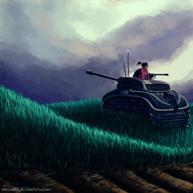
Here is Vicky Vasquez in a tank in a field studying a map of some sort.


I actually wanted to do a painting study with no linework, however not limited just to my usual SAUB, but my KNKL Chalk Brush, though I ended up using my Helen Chen Brush for the grass and tank texture. It started as a mood study of a tank, not a strict copy (just going for a similar mood), but then Vicky replaced the vague human figure in the study for more personalization.


I'm a big fan of illustrations that show characters on their off hours, the more non sequitur the better, so this felt like a great opportunity to just put Vicky in a quite random situation. So when she isn't reporting, maybe she's off driving a tank looking for treasure or something.


While I tried to keep this as one-layer as possible I ended up using just a few since the point was to keep it simple, but not add endless hours for unnecessary difficulty of adjusting this but not that, senseless repainting, etc. I'm feeling better about this, and I do credit the SAUB single-layer studies to being able to make this judgment. I guess it's like learning long division before you can earn the right to use a calculator.


This is the original version to the Dailies, but I didn't like how the cloud formation break made it seem like the gun was firing. While I was remodeling the clouds, I made a point to try applying some value stuff I'd learned to make the composition flow a little better, same with the bottom grass getting darker and snaking more blatantly to the tank.

Not normal,

Reuxben

Wednesday, July 5, 2017

FanArt_71117


I wanted to draw something for 7-11 Day in Japan, but not have it feel too sell-outy, so I thought of a little romantic scene where the relationship is made up and the rain drops don't matter.


The idea here is a little rainy scene with two people kinda lost in it all, viewed from those tunnels you see in Japan, particularly the hideous one I had to walk through every day to the old day job.


The image is a take on that popular JP trope of a guy and girl fighting, but then the guy reluctantly giving the girl his drink or whatever to make up. I should note I've never actually seen a Big Gulp in Japan...do they even still have those in the US?


Anyway, I made this entirely with my two Helen Chen Brushes and it felt quite great...all the training with Steve Ahn's Ultimate Brush really made easing into this brush for free-paints feel a lot smoother.

Not normal,

Reuxben