Friday, July 29, 2016

Fun_SsummerrFfunn


(Updating to a scanned version...I think I'm getting the hang of manual color adjustments...but the scan still doesn't feel as crisp or quite as true as my camera...the hat for instance looks too aqua in the scan, not as Yale as it really is...)


I'm doing a series of summer postcards for a little give-away situation. Didn't know what to draw for this project since the theme was "summer" and "well wishes" for hospital-bound people, so I just went with summery outfits and general cheeriness.


I've been told it's wisest to focus on digital 100%, but I love traditional so much, so I hope this is not too detrimental...Felt great to bust out the G-Pen again and get some Copic action in, too. I have to say, I love the faint scent of both the G-Pen ink and the Copic aroma (though from a distance), especially when you have a stack of pieces in front of you: they give off that little combo olfactory hug you just can't get digitally. It smells like you've accomplished something, on top of just tangibly feeling so.


Fun Facts: When I was a bit more exasperated during college, I would draw chipper chicas, often Nyao, to keep me afloat, so hopefully this helps people out there, too. I don't know. Sometimes living out here is like living out on a deserted island, you know? Anyway, this color scheme was inspired by the Magic Origins Chandra Nalaar prerelease handout that I use as a hand guard so I don't mess up pieces underhand as I work on them.

Easter Eggs: my Yale hat, which after all these years is finally coming apart...Base Ball Bear, an excellent, if softer, JRock band.


Bonus "dramatic" version. I stumbled across this when I was adjusting the scan's colors and made a new layer with the original, non-brightened scan on top with a mask poking the brightened scan through, so I could isolate the more accurate, darker version of the hat.


Oh, here's the thumbnail, too.

Reuxben

Wednesday, July 27, 2016

Fun_ParkerPosey


A school girl hanging out at a nearby park.


This was a study of a photo jammed with a photo I took of a local park, and then run through the old filter rigamarole.

Reuxben

Monday, July 25, 2016

Fun_JessWoman_L


I live-inked this with a fudepen, so no pencils, just straight to pen, and a pen I'm not even super used to controlling, to boot. It was quite intimidating. It's a mash-up of Team Rocket (Jessie, obv.) fan art and that famous Adam Hughes Catwoman cover where Catwoman looks all beat up and just taken-in from the rain into a police line-up. The serial number is Adam Hughes's number divided by two, since this is half his concept. "Hughes's Number" sounds like a physics constant or something, by the way.


I did think about just saving the hassle of the text and just doing it in post, but in the end, the point of this was to do something difficult, and besides, I thought live-inking the text a great opportunity to up the challenge just a little more. I did end up adjusting the it a little in Photoshop, but that felt fair since I had first completed the original task. I am torn between the "image as created" vs "image as intended" camps, but I know that in reality, the latter is what's truly important--the final image, not what things started

Finally, on a related note, you can find a fascinating interview with Adam Hughes where he talks about the original piece on Sidebar Podcast, which presently has but an incomprehensibly scarce few of their massive collection of interviews posted to their youtube channel, though unfortunately they seem to have taken down their site...

Reuxben

Friday, July 22, 2016

Fun_DidiPizza


I knew I wanted to color this pizza box piece, and was on the fence about Copics vs. digital. I was on the heels of a Twitter deadline, had just seen a KNKL guide on photo filter effects, and was feeling more pressure than usual to go digital, so I decided to go in with some Photoshop, hoping to see how fast and simply we could color rather than paint. After posting to Twitter, with like a minute to go before deadline, I decided to bring it a little further, as like a hypothetical teaser poster for Splinter.


Here's the textless version. As far as bitter, bitter, inside jokes go, I should note I hate any permutation of the word "friend," and use such a word only with extreme care, if ever. I have allies and associates, mostly people/someone "I know" but I simply cannot use the f-word loosely. It's too dear.


Back on topic, here it's a little easier to see the duality that we played up to honor that theme of the comic. You'll note half of her is darker and the other half even has a phantom-y effect over it, lifted (albeit more subtly) from this old Didi PhotoJam.


This's what it looks like when we take away all the trendy filters, and yes, I'm actively practicing those effects...I don't normally embrace fads of any fashion, but I legitimately like the slightly gritty effects you can get.


Anyway, this was the Twitter version we squeaked in just under deadline. I looked aight to publish, but after the cookie of posting, I obviously felt the mouse to give it a little more.

Reuxben

Wednesday, July 20, 2016

Fun_GoGojira


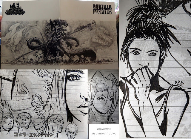
Some more sketches from the Gojira notebooks. The 7-11 free-notebook promotion ran until the 15th, but fortunately I was able to get a notebook every day, mighta even doubled up a couple days. All you had to do was buy two items from the bread section. Super easy, and pretty much what I'd buy anyway. The above piece, by the way, is vaguely inspired by James Jean.


There are four types of notebooks, but this one's my favorite design. However, it's watermarked with the cover image across each page, so you can't get any clear drawings in. But I've taken this as a good thing: it disincentivizes getting too precious with the drawings, so I can feel less pressure when I draw in them. Two of the designs just have ruled lines, but they aren't as cool.


Anyway, I've decided to use my stack of notebooks for studies, and more specifically, loading it up with gesture drawing. This is what a bunch of 1-minute studies look like. I also do a 30-second shift. I hear this magically makes you better, so inject it into my eyeballs and let's do this.

Reuxben

Monday, July 18, 2016

Fun_KnightSigh


As an exercise, I decided to fill a 100-page pocket sketchbook throughout June with live-inks, so no pencils, and with the hopes of filling it primarily with more intricate pieces like this or even that, as opposed to super loose stuff. This is one of my favorite "complex" pieces from the run, also one of the latest.

Hmm. I don't draw much medieval/fantasy stuff. This was kinda based on the idea of a reluctant knight or something...or like she's not certain she's really the pick to head into the big leagues, you know? I mainly wanted to draw complicated costuming off the top of my head while still including "rest" areas, too, like the collar and cape parts.

Reuxben

Friday, July 15, 2016

Fun_MyIdiotsInColor


Got my color photos back from the print shop and Nyao and Zero were even nice enough to sign it.


Here's the uncropped version, where you can see where the print shop colored over the negatives.


And this was before they processed the background.


They also sent me a spooky version that was lacking lines.


And then they even included the raw colors before all the adjustment layers.


And the lineless version of those unadjusted colors, too, how neat!

Reuxben

Wednesday, July 13, 2016

Fun_DomriNation


Oh, man, what a deal. Right now at 7-11, if you buy two bread items, they give you a free Evangelion/Godzilla notebook. Collect all four! I know I did!

[Not a sponsored post, I just like getting a free sketchbook every time I 7-11 it up...currently swimming in sketchbooks. Granted you have to be ok with the watermark and ruled lines, but I use these just for loose practice sketches anyway...minus these more involved Copic pieces.]


Anyway, this was the last page of my first "sketchbook," Domri Rade, the only MTG planeswalker I have any interest in as a character. I mean I read his lore stories and they weren't that gripping, but more just as a concept I find it interesting that a kid is a planeswalker. This betrays my bias against stories about adults, I guess, which I've discussed already, but basically, I can't wrap my head around adults not having everything already figured out, so who cares what their problems are?

On the art side, between you and me, I don't know why they give a certain artist all the planeswalkers, it seems quite unfair, even just on a numbers level, but also...well, I would not say his is the look to get. Tyler Jacobson, however just smashes it, regardless of whether or not he has a marquee card, notably see what he did with Domri Rade. I particularly love that orange glow in his ear for some reason. But in any case, other artists seem considerably underutilized.


For instance, Volkan Baga feels a bit wasted on monsters and stuff, especially as he is very much the student of master portrait artist Donato Giancola. And I'm still waiting on the Johannes Voss planeswalker--imagine a PW from the guy who brought you Thalia or the GP Chiba Sakura Angel. Min Yum could also do great if they'd just loosen up on the devotion to human planeswalkers--I can see something sinister-leaning, like the murkiness of Ashiok. Karla Ortiz, by the way, is also notably short in the PW department, though she's certainly killing it on legends. I guess, ultimately, some more diversity on PW artists would be swell.


Oh, and this was a sushi-themed admiral of some kind. Her outfit is sushi, you see...

Reuxben

Monday, July 11, 2016

Fun_TinazTacoz


I wrapped my 100-page pocket sketchbook from June, and this one of the the penultimate drawing: it's Tina from Tina'z Tacoz.

Reuxben

Friday, July 8, 2016

Fun_Flow


This is from a study session of stills from a movie trailer. I don't normally watch trailers, let alone movies, but I heard Radwimps was doing the soundtrack to an animu so I had to give it look.


To save focus during the week, I've been pre-posting a week in advance, hence the "12:01 am" publish times. So I'm hoping the emotion behind the coloring/design is alien to me by the time this goes live.


I'm hoping I don't even remember/understand what I'm talking about right now. But part of me never wants to forget these kinds of emotions because they fuel me.


Ah. Friday's our "big" update day, so might as well post a few more from the session. The through-line was that I wanted one red-tone in otherwise totally BW, landscape-oriented images, with limited hatching after the first image. Oddly enough this very topic came up recently...


I heard LeSean Thomas studied the first and last moments from movies like the 5th element to study composition, so I figured a similar approach might be helpful here. I only own two movies (Iron Giant and a Bill Burr stand-up special), so that might be a cool study opportunity.


This was the shot that started it. I saw this frame and wanted to capture that moment. Then I thought of LeSean's study and scoured the trailer for more interesting frames.

Reuxben

Wednesday, July 6, 2016

Fun_RainCoatCheck


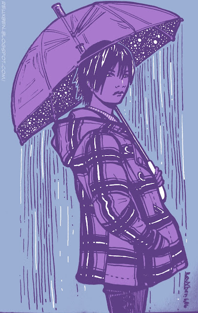
I wanted to try something more designery, like this could be on a high-end t-shirt or something and rather than question it, people would just go with it.

Also, I love the rain, and it was raining that day. Just beautiful.


This was actually from a study session of some photos I saw on Deviant Art. This was also the first time I used my white pen to remove stray lines, but as I suspected, it indeed feels like cheating...

Reuxben

Friday, July 1, 2016

Fun_FeelGoodMan


Yeah, yeah, yeah, I'll pay, when tomorrow, tomorrow comes today.
I love Jamie Hewlett's work so I thought I'd leaf through my Gorillaz CDs' booklets for inspiration and this ended up being a live-ink study of a bunch of Noodle's outfits from the three Gorillaz CDs I have (the first two LPs plus G-Sides). The longer I looked at the G-Sides cover, the more I was intrigued by the color scheme they used, and thought I'd try to match it in Copics, and then all this happened, as they say.

So this is the scanned version of the piece, but as I suspected yet again, perhaps my scanner isn't up to snuff, especially compared to my camera...I had to adjust the colors extensively to get closer to what they look like in real life, but it still just has quite a heavy red bias. Colors aside, the capture itself is off...it comes out noticeably blurrier, especially compared to my trusty camera.


But speaking of my camera, this is Cammy's capture and it really does look a bit better, if I had to choose one (and I did). Once again, the camera gets closer to the actual colors I used, particularly on the skin, which here are closer to brown than red. Given how much the camera trumped my scanner here, I am a bit in shock--I thought my scanner was a tank--but it looks like my camera really is the stronger fighter.


I haven't scanned lines in a while, but I believe that and other BW work will have to be my scanner's destiny from now on, though these lines are via my camera. The only issue would be crispness, but that hasn't been a problem in the past. I wonder if the scanner is faulty and I never realized it...but I've had it since I came to Japan and don't recall it being poor before. Maybe the second move damaged it--I noticed the bright light doesn't pop up on the initial scan pass anymore for the preview capture (at least I think I remember it emitting a bright light during initial sweeps). Maybe I'm just not scanning correctly or something.


In any case, here is the process breakdown. A couple notable steps, this is my first time drawing on Copics. For the background, I knew I was going to live-ink it, so I thought I'd draw over the base color to prevent any rando ink swiping, though in retrospect, the G-Sides cover has even the blacks tinted red, so for that effect, I probably should have let the Copic tint the lines, too. But there was no smearing on the finely detailed areas so it wasn't all downside. Similarly, I realized dabbing rather than brushing color over finer inked areas like the jacket inlining helps prevent smearing.

The second notable thing is that this is the first time I've used colored pencils on a Copic piece. Not sure I'm doing it right, though, again, trying to mimic Eisaku, but I don't feel I'm getting as much punch out of them, especially on white. This is also the first time I've Copic'd over Copics, and using the pale red wash as a base was a little scary since some Copics seem to "spoil," or make this acid-ish texture emerge, and this indeed happened a bit on the grays of the railing, but after it all dried, it ended up looking fine, so crisis averted!

And lastly, I wasn't sure about putting in the white ink rim, but the G-Sides cover had that effect, so I went with it, though I do wish I had a thinner white pen. Mine's pretty good, but I am finding it can get a touch runny and after drying, it can end up washed out a bit. Owing to its thickness, it can also be hard to get to go precisely where you want. It also has a pernicious habit of clumping shut or getting streaks right in the line, so your carefully planned lines can get randomly thrown in danger (see the bottom right of today's piece). Still gotta crack open my Deleter white ink, maybe that's the answer...


To close, I thought I'd document the ever-important skin tones this time. I like trying out different mixes, and this was today's gamut, applied in left-to-right order. I try not to lean too much on "white" skin, and I've been collecting darker skin tones, to be sure, but there's definitely no shortage of expressive "white" skin available (heck, pretty much all the flat-out "skin"-named tones are "white"). The other photo is of a few of the colors I used for the rest of the piece.

And that is how we slow jam the news.

Reuxben